Datica Health Brand
Building a B2B brand for healthcare IT tech leaders
Datica Health is a healthcare cloud startup that solves compliance (HIPAA, HITRUST) and integration with EHRs (electronic health record). Formerly known as Catalyze, in 2017 ahead of our Series B fundraise, we renamed and rebranded the company as Datica.
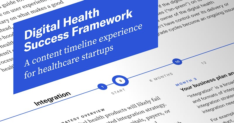
As the design lead at Datica, I supported the marketing team by building out the entire public-facing brand, including a new website, magazine-style print guides and reports, trade show booths and ads, presentations, animations and video.
Datica Health Brand
Datica Style Guide
Ahead of a company merger in 2019, I wanted to get ahead of dealing with new vendors and proactively establish the rules and rationales in the various brand properties and projects for the new, combined company. Collecting the entire system in Figma and organizing it by element type and medium helped educate the audience and get everyone up to speed quickly.
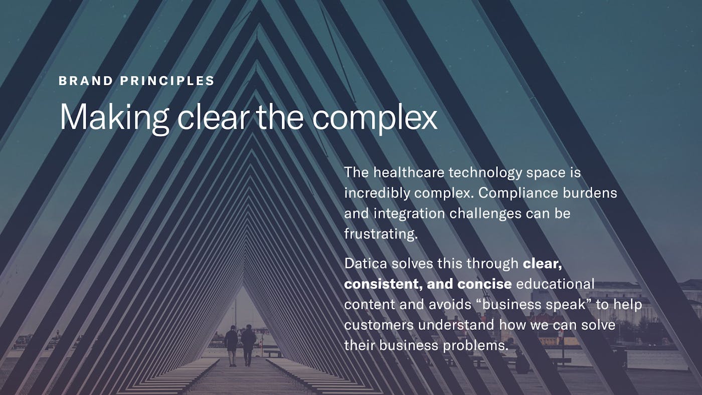
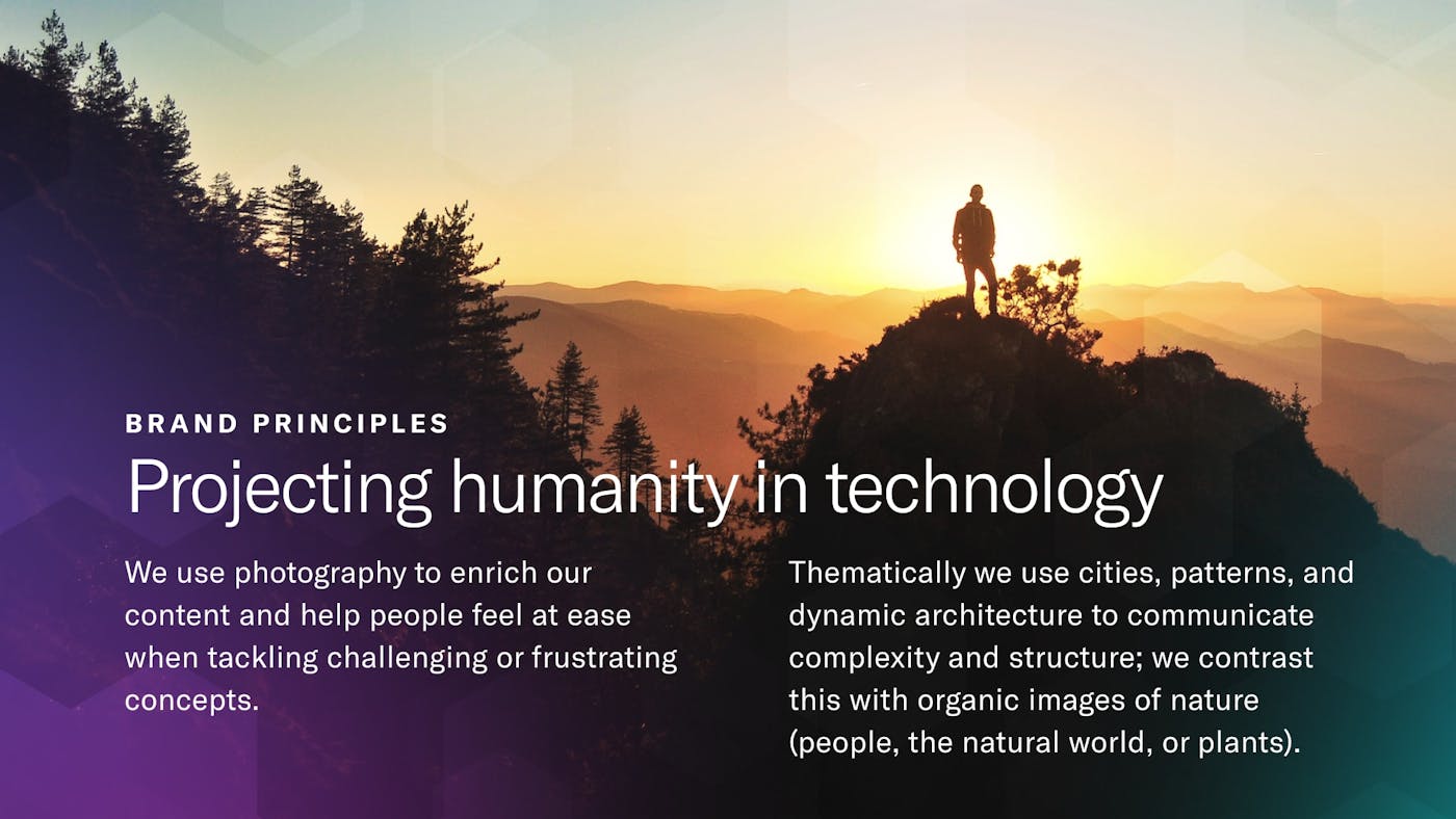
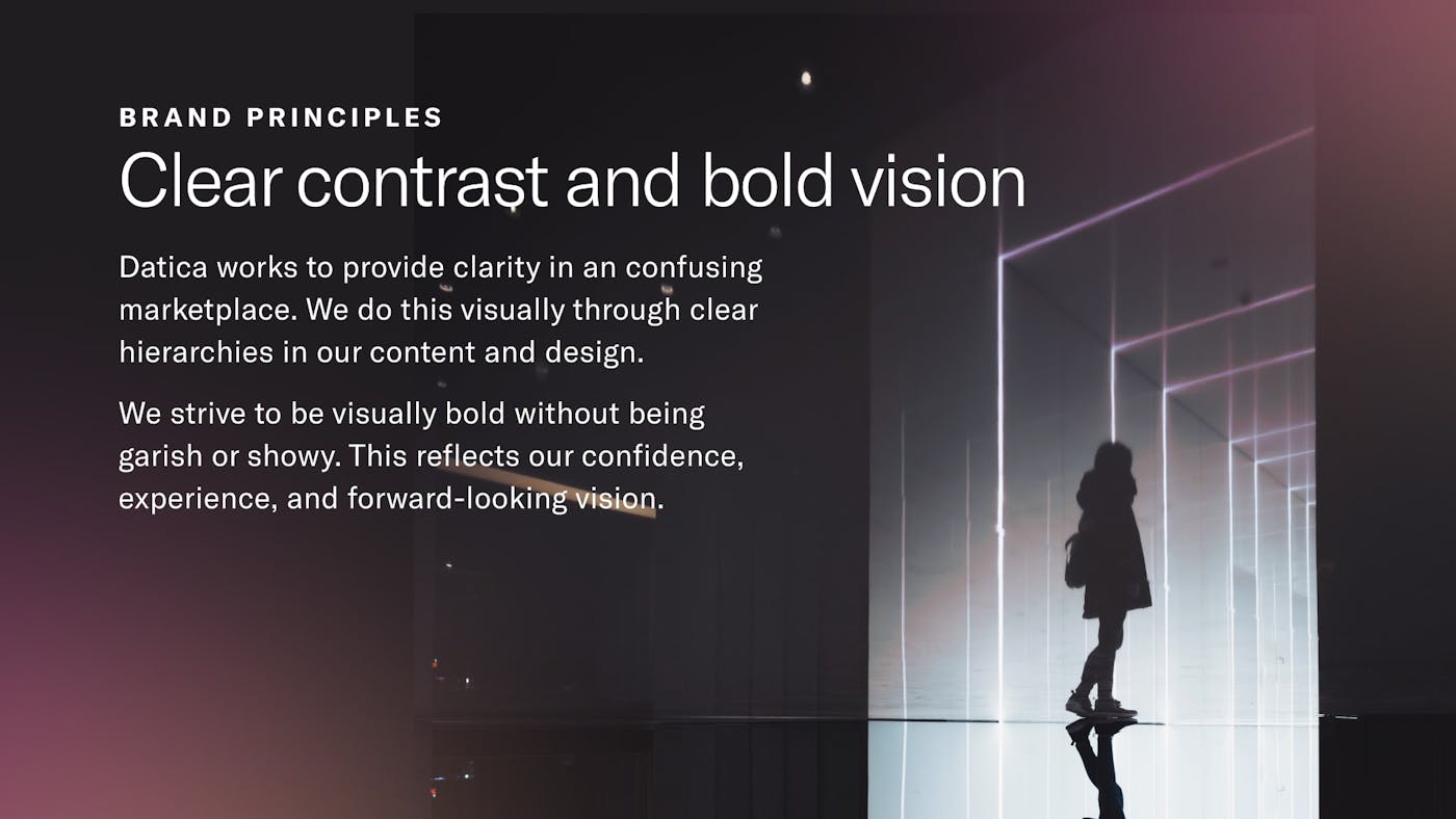
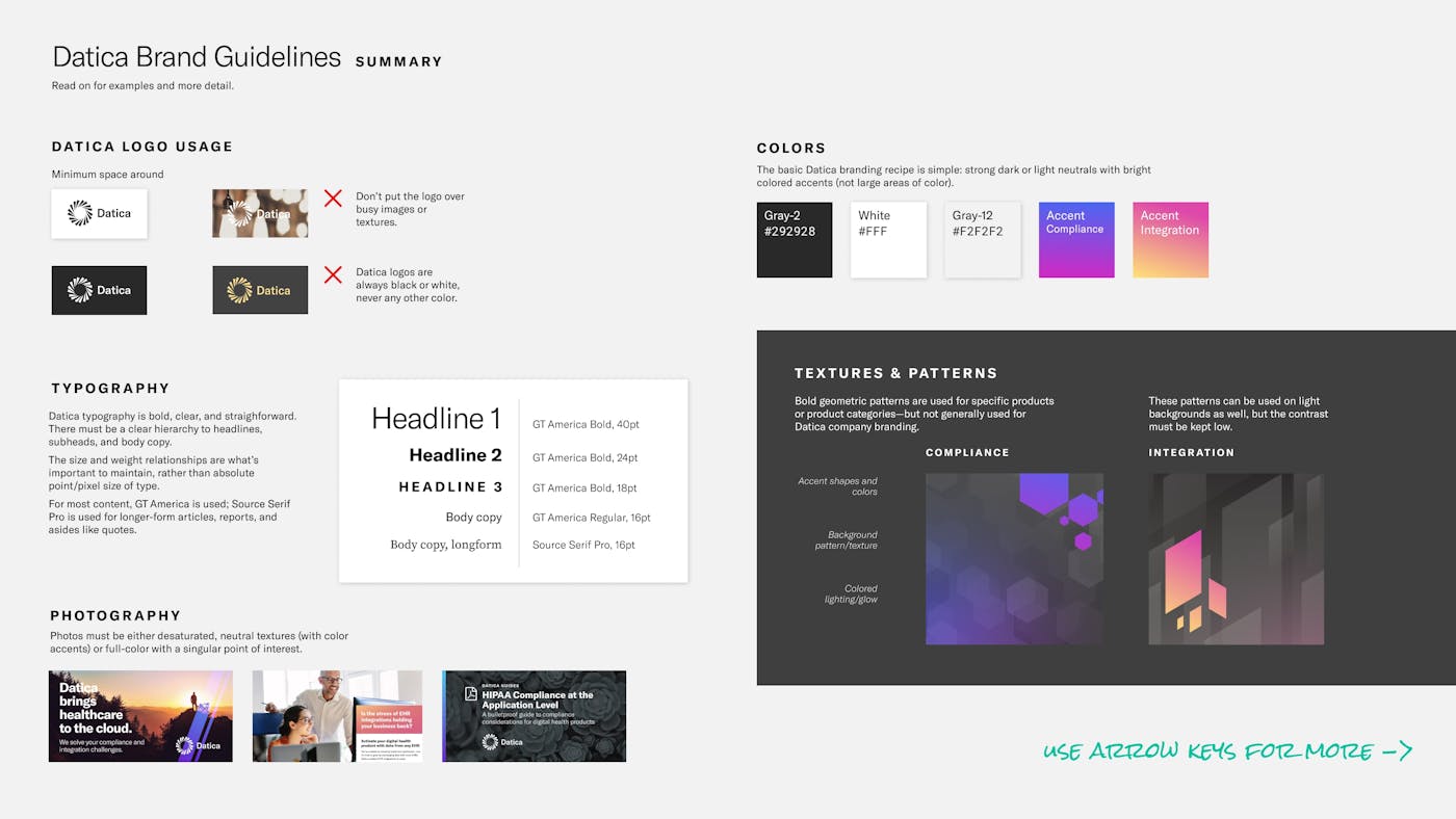
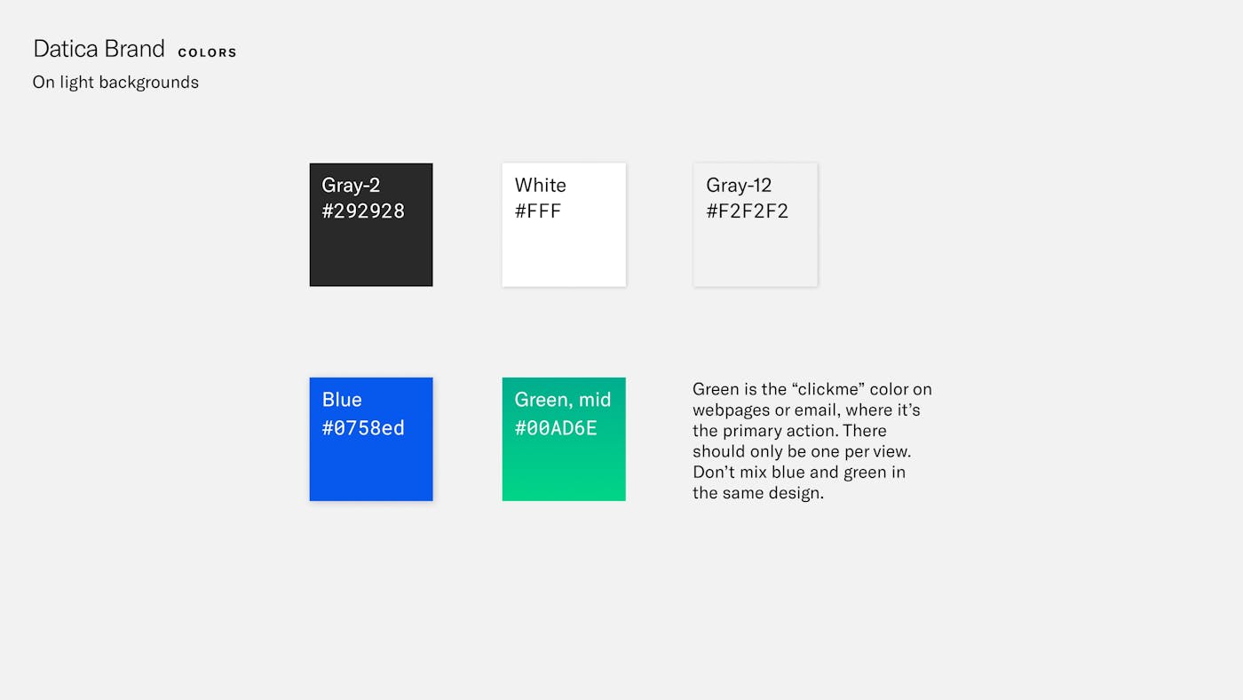
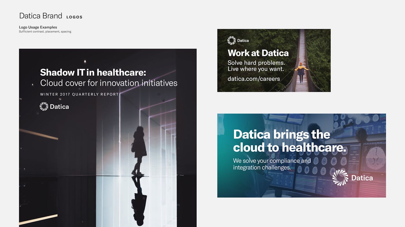
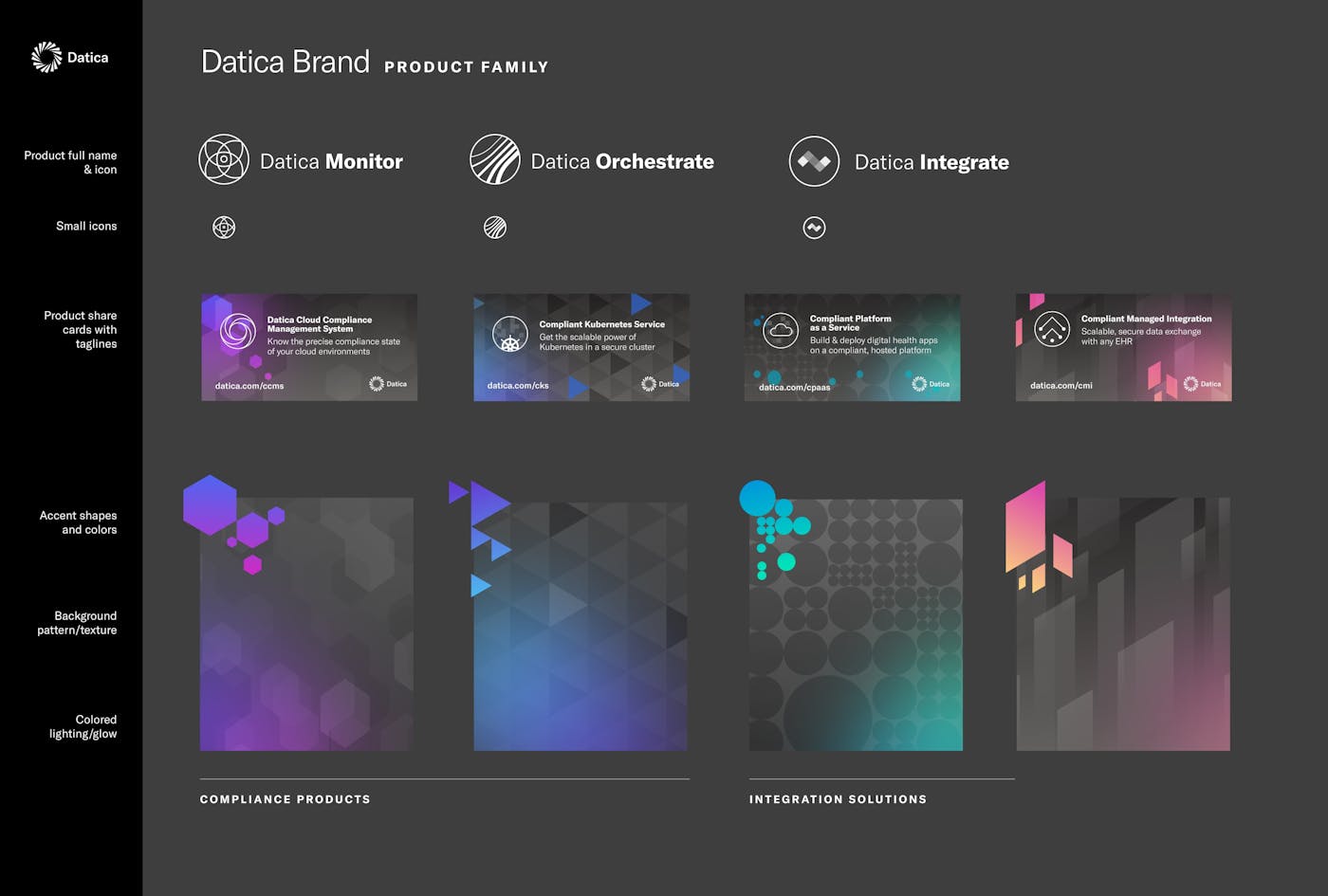
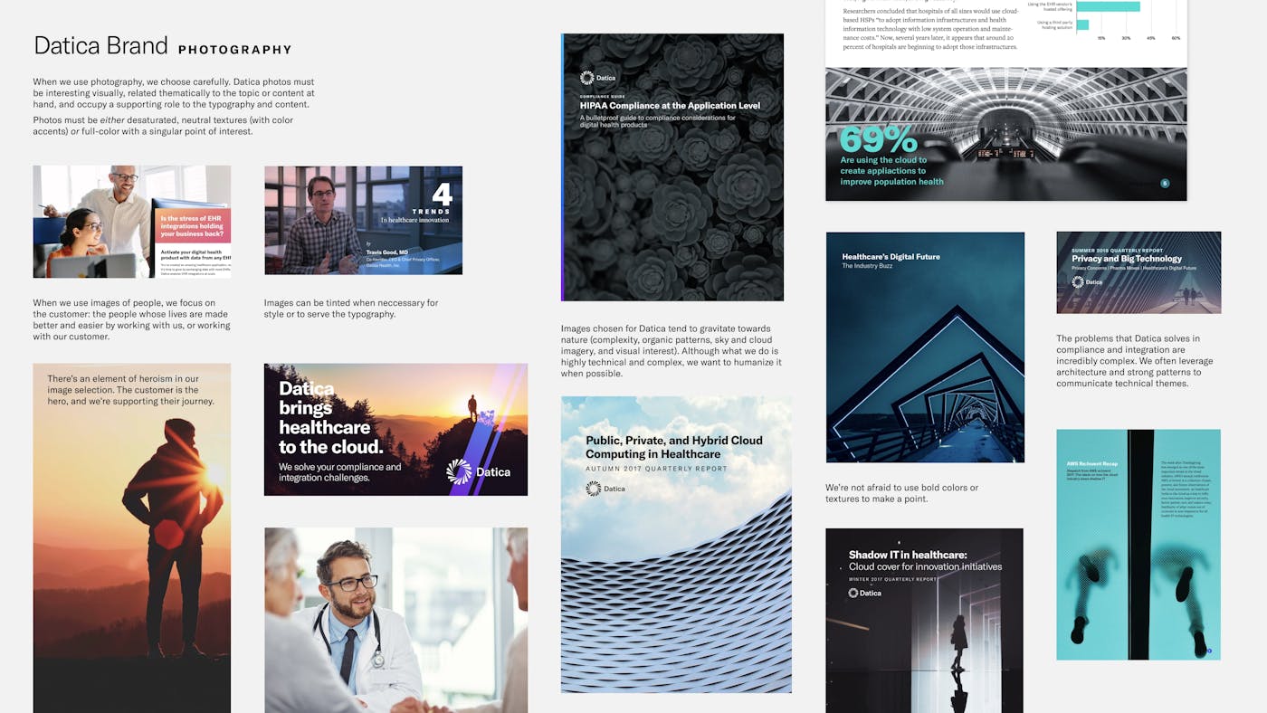
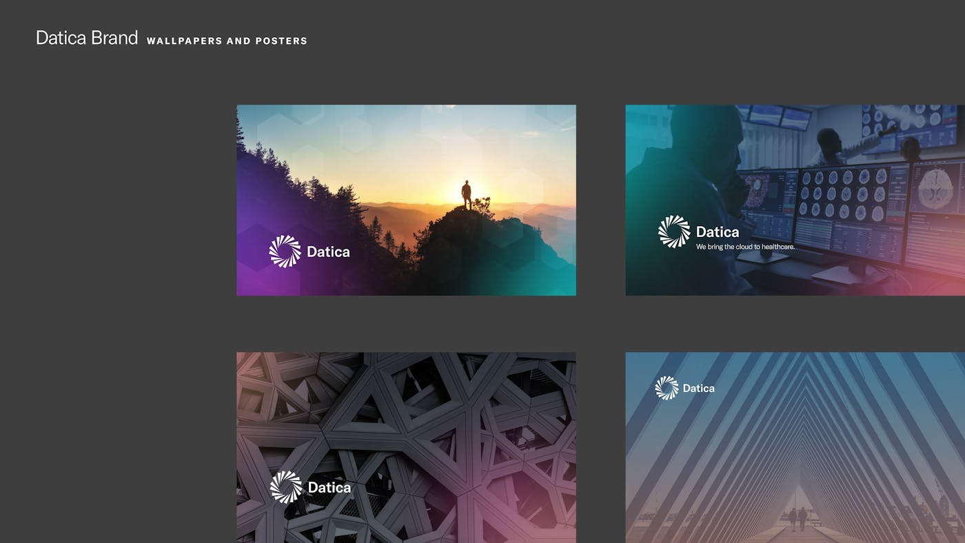
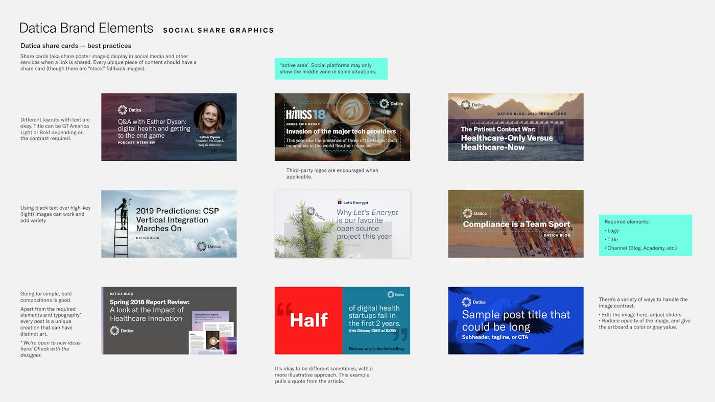
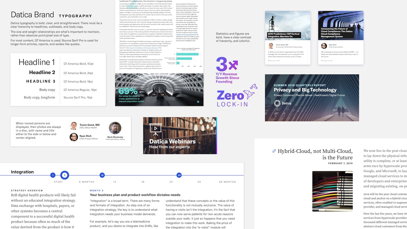
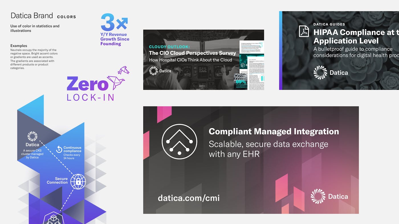
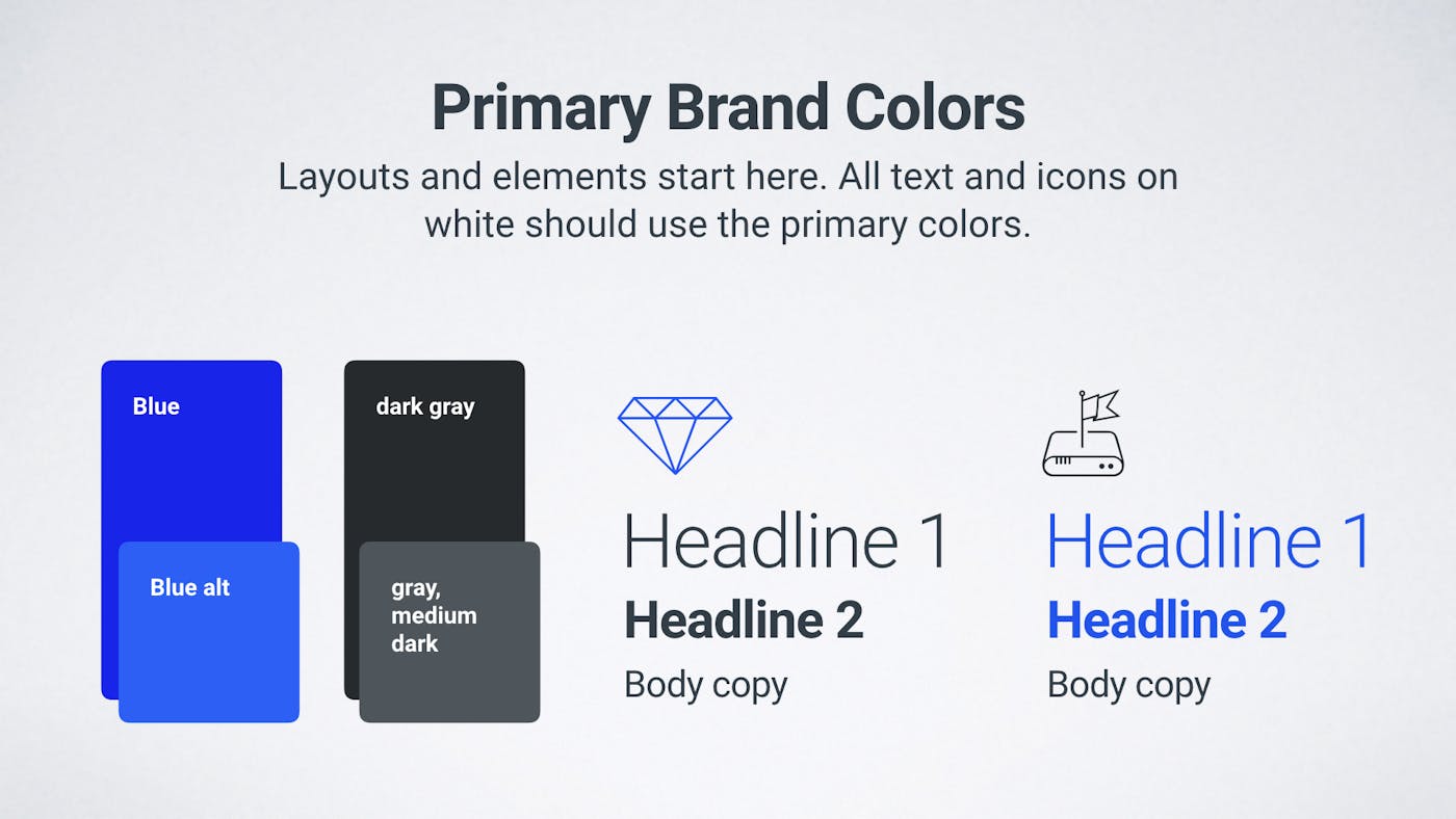
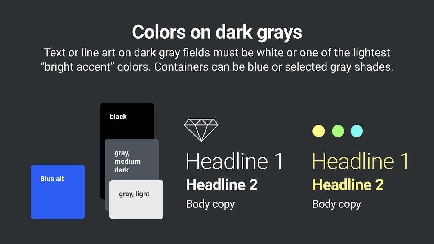
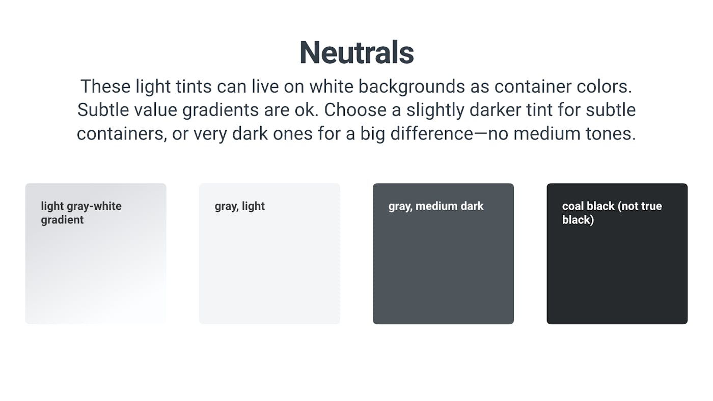
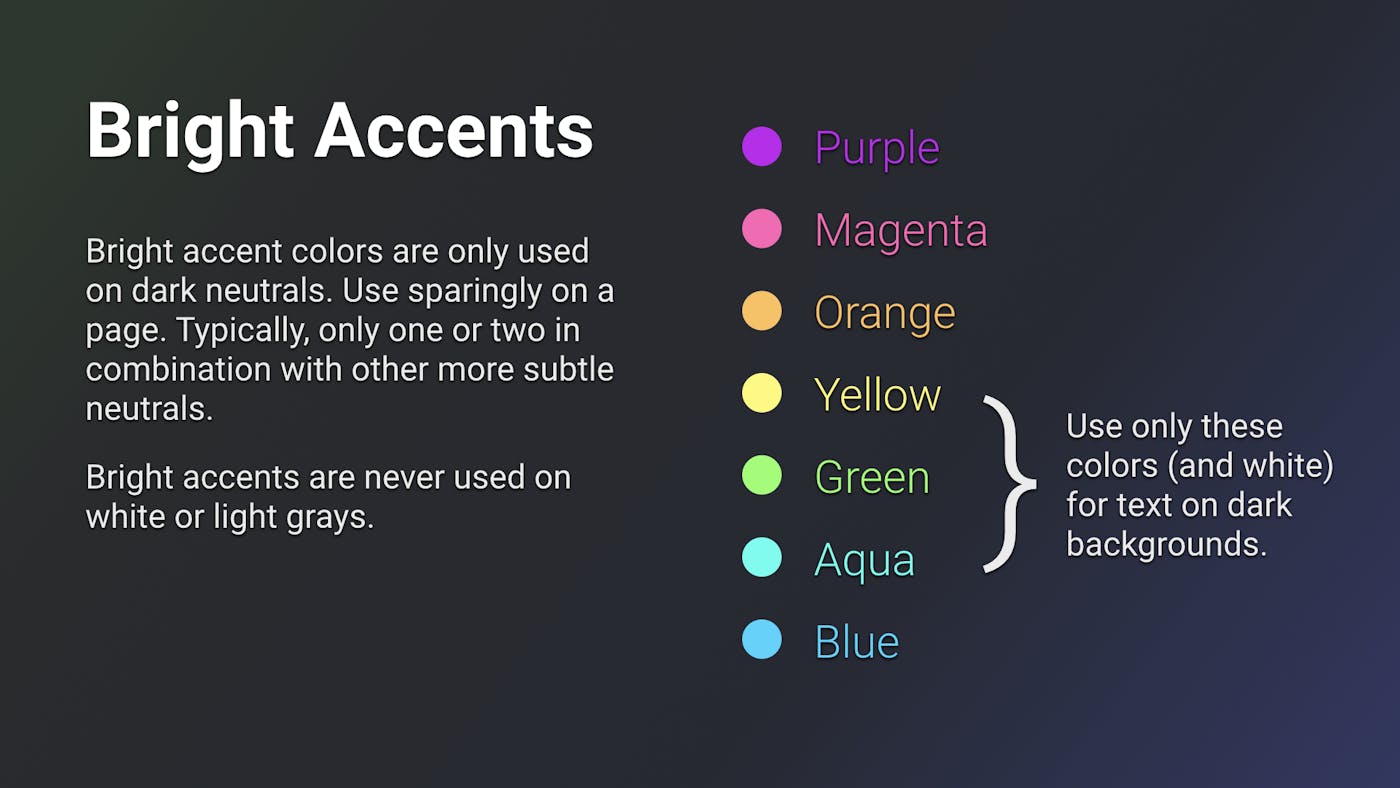
Bold colors, used with restraint
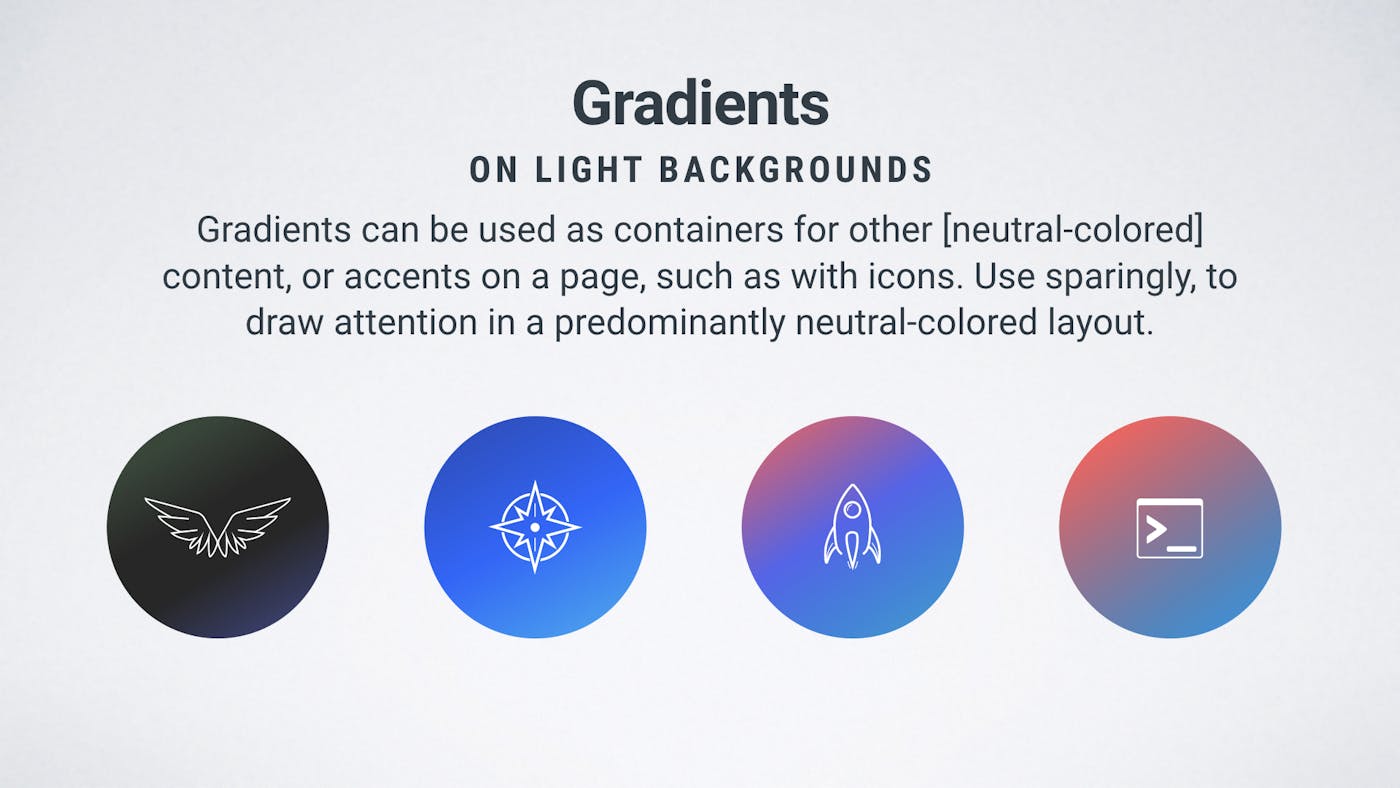
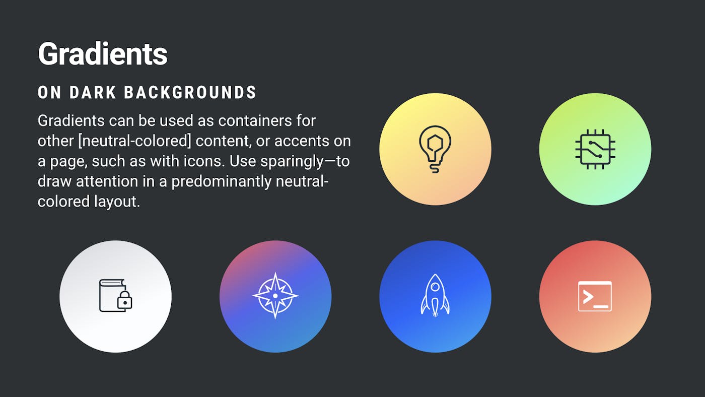
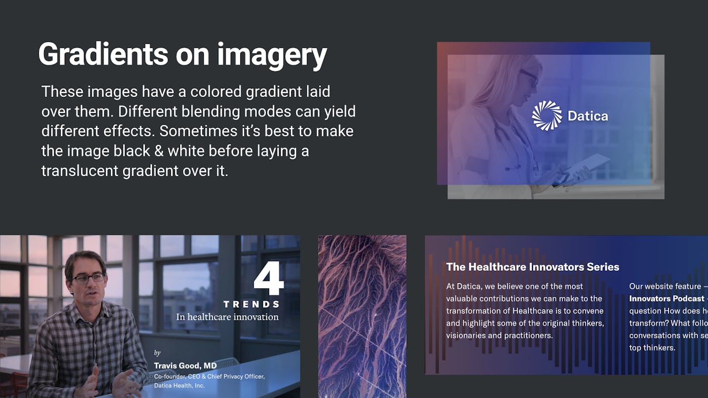
Neutrals occupy the majority of the negative space. Bright accent colors or gradients are used as accents. The gradients are associated with different products or product categories. When accent colors and shapes are used over dark images, “glow” lighting is used to give a sense of depth and space.
Early concepts & development
Exploratory tone & style through presentation design
Before I moved into UX and product design, I had the privilege of working as a video editor, motion design, and live event designer for 7 years. Among the principles I learned to appreciate was the power of the “full-screen” experience when you are trying to evoke a particular feeling or response.
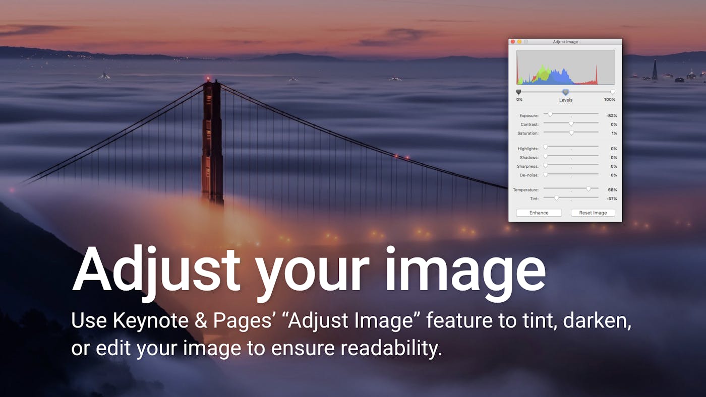
Keynote is one of my secret weapons. It’s fast, animations are effortless (Magic Move as a concept is everywhere now), and it can be output to images, PDF or video easily. I lean on presentation design frequently throughout projects.
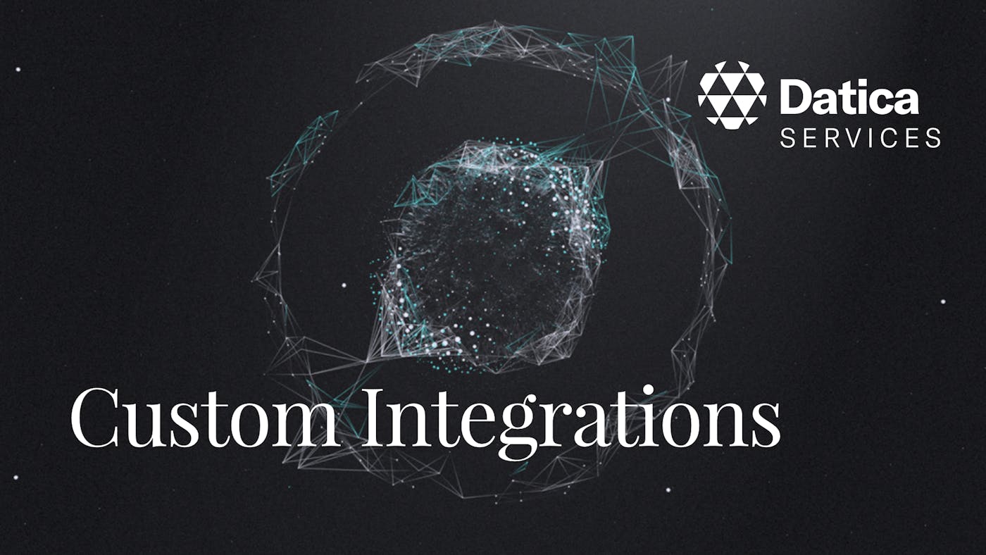
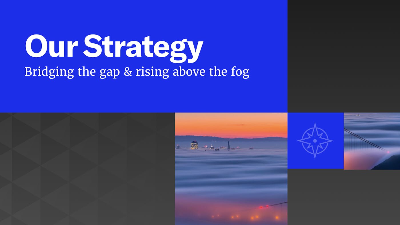
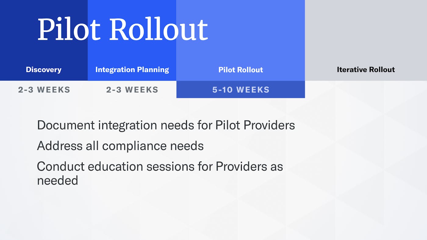
Here are some early “style tiles” for quickly establishing the right tone, color palettes, even animation behaviors. These didn’t make it to the final brand but they helped us rule out avenues that didn’t resonate with customers.




2017 Style Guide
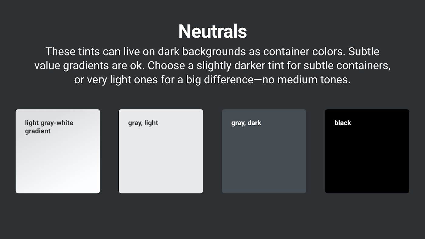
This was the direction the brand evolved into after the launch in 2017. My approach is to lead with projects and the needs of the business drive the style guide, rather than start out with a rigid direction that may not fit the needs of the moment.
This is a continuous cycle of expansion (adding new projects) and refinement & synthesis. The style guide is both a reflection of the existing brand state, and an aspirational guide for new work.
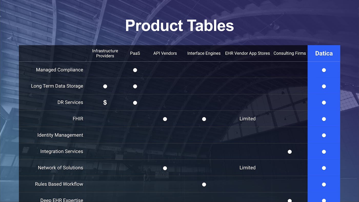
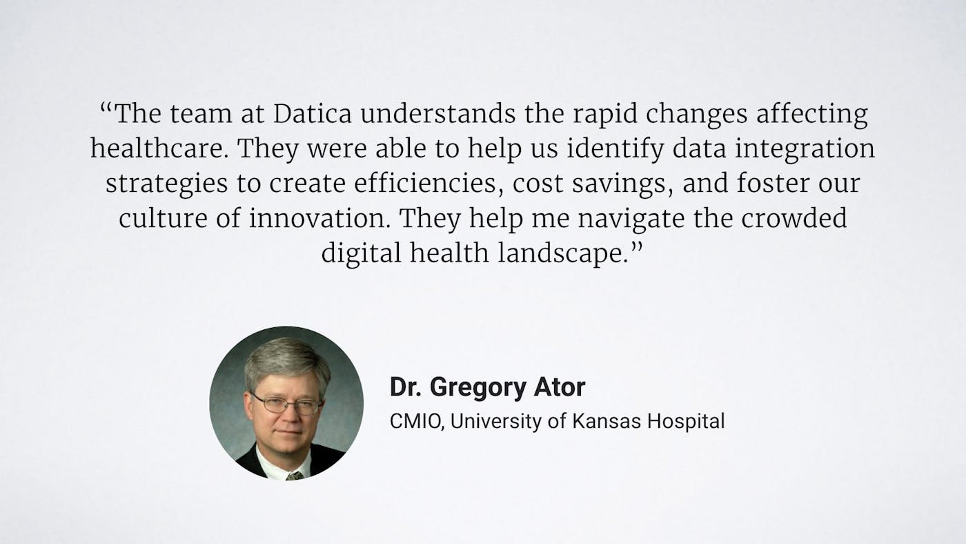
The guide acted as a design system living in an InVision board, including design rationale and rules for a wide variety of applications.

Web Planning & Prototyping
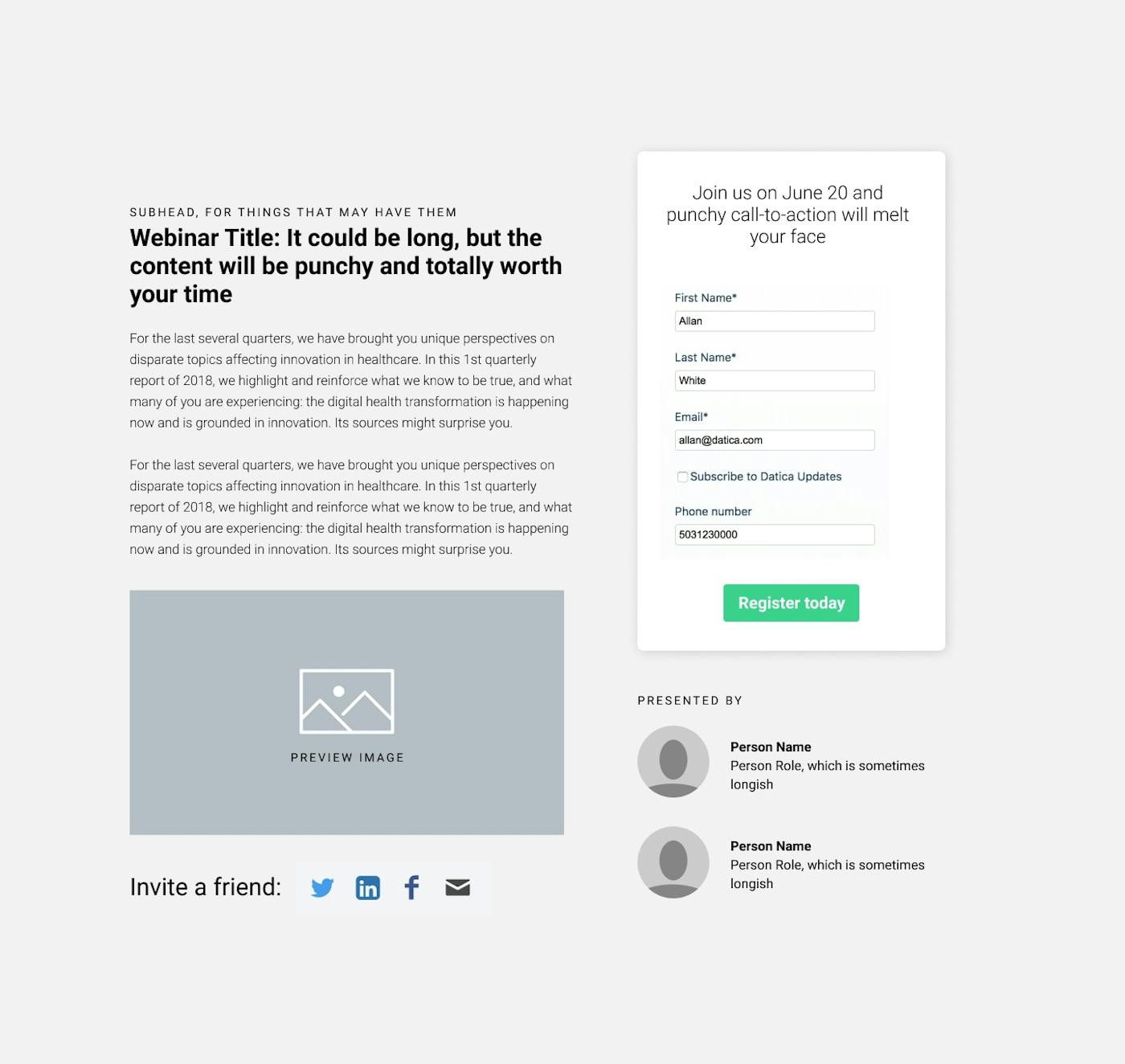
In the beginning, we only had the logo and a typeface, GT America as the core elements. For launch, we needed a new website. Previously built on Kirby CMS, we wanted to move to Contentful and Middleman, a Ruby-based static-site generator (as we had Ruby devs & experience).
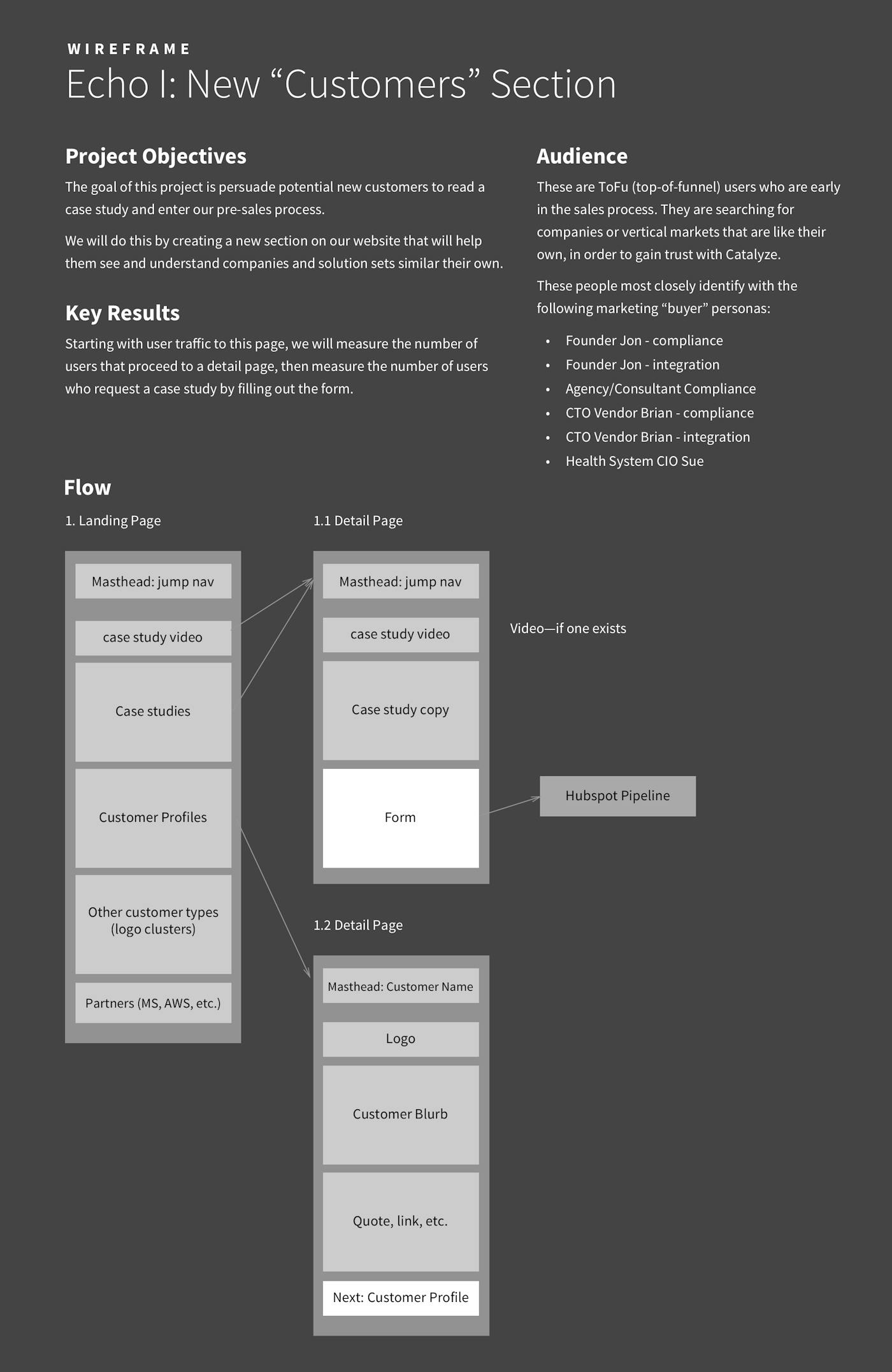
The product team, led by CPO Ryan Rich, and VP Marketing Kris Gösser, took the lead on early-stage writing and wireframing so I could focus on iterating on styling and web technology.
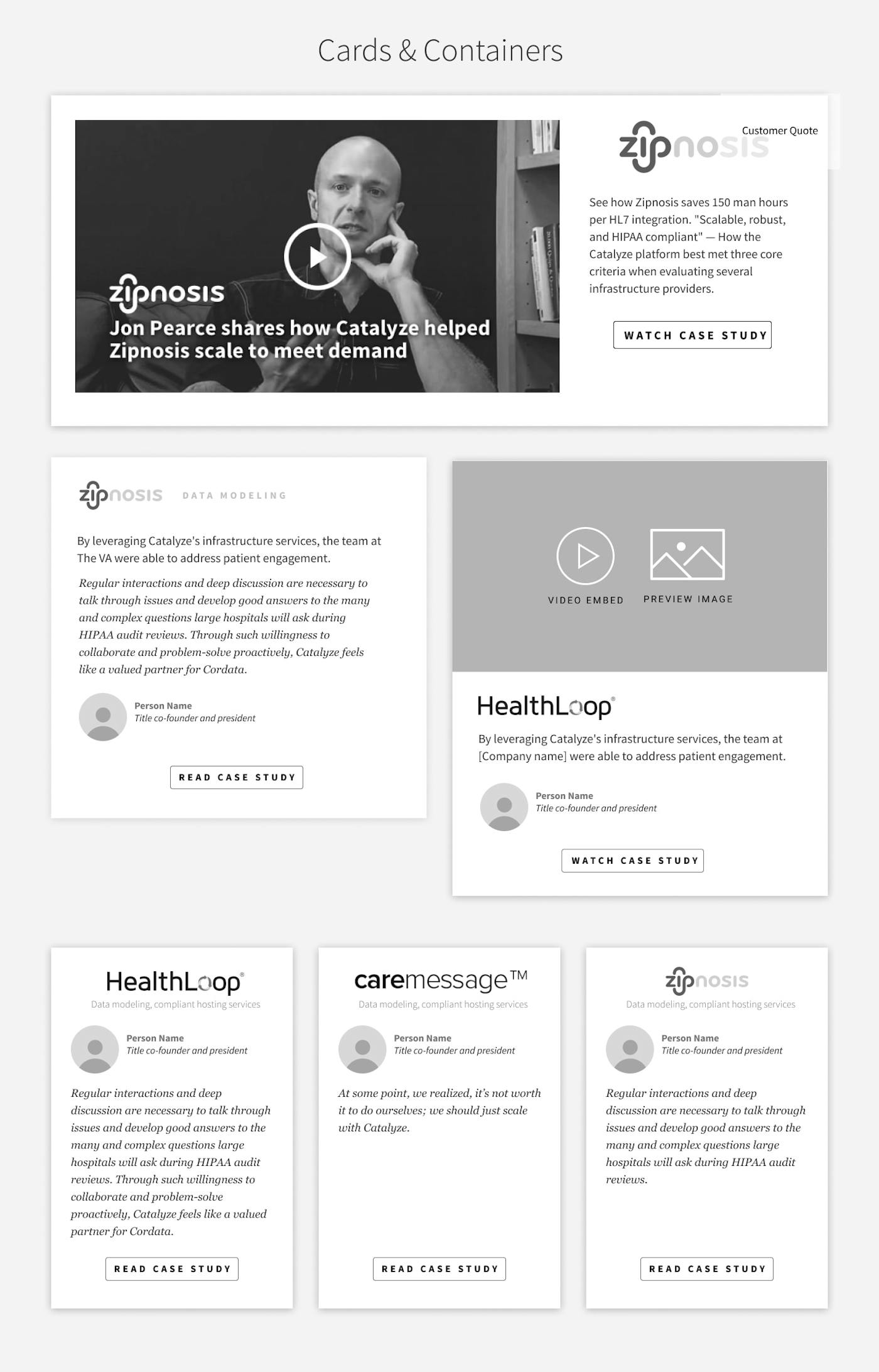
Shown here are some early-stage content collections, user flows, and wireframes. These design patterns formed the basis of all future wireframing efforts; these began in Sketch (reviewed in InVision and moved to Figma eventually.


Beyond web: into print and video
"Datica takes on the risk" animation
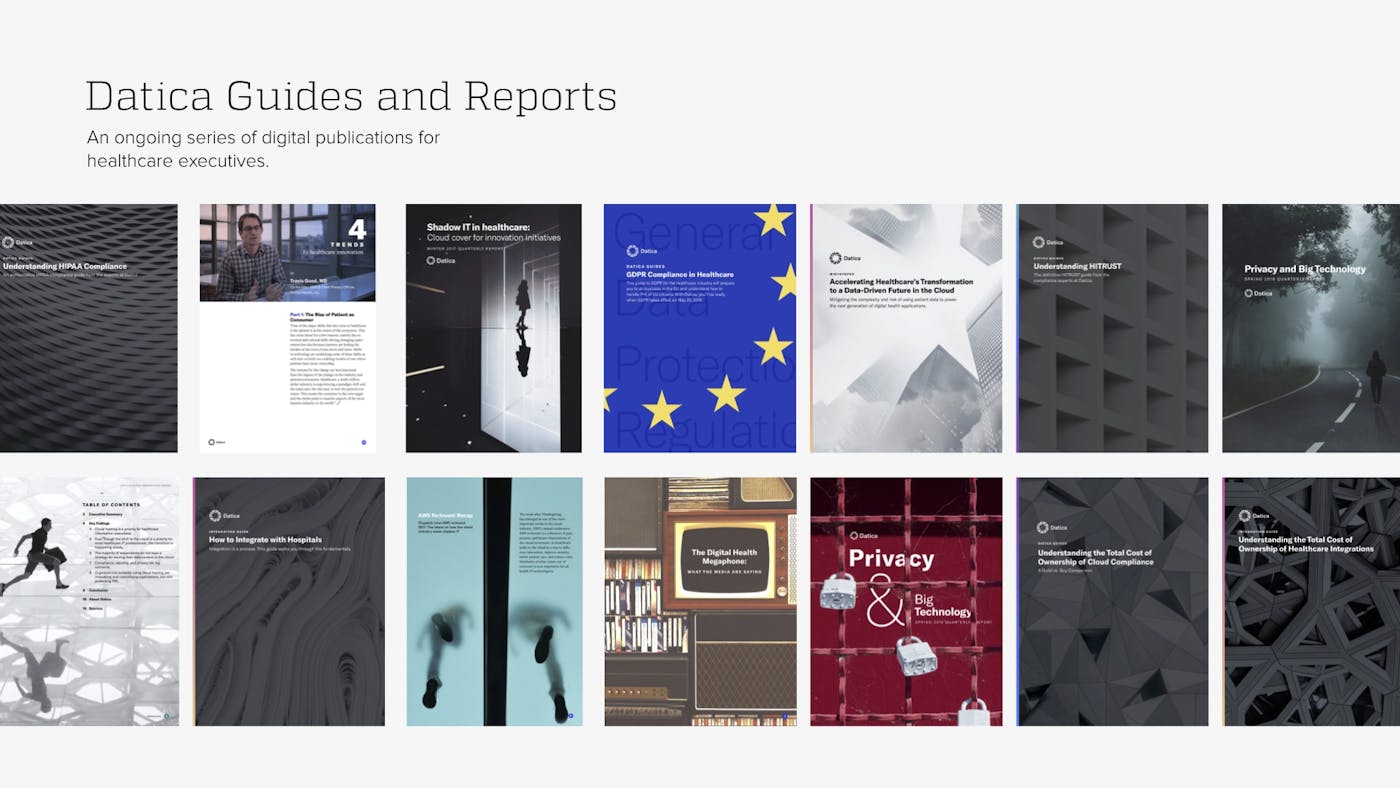
Supporting Content Strategy Goals Through eBooks, Reports & Guides
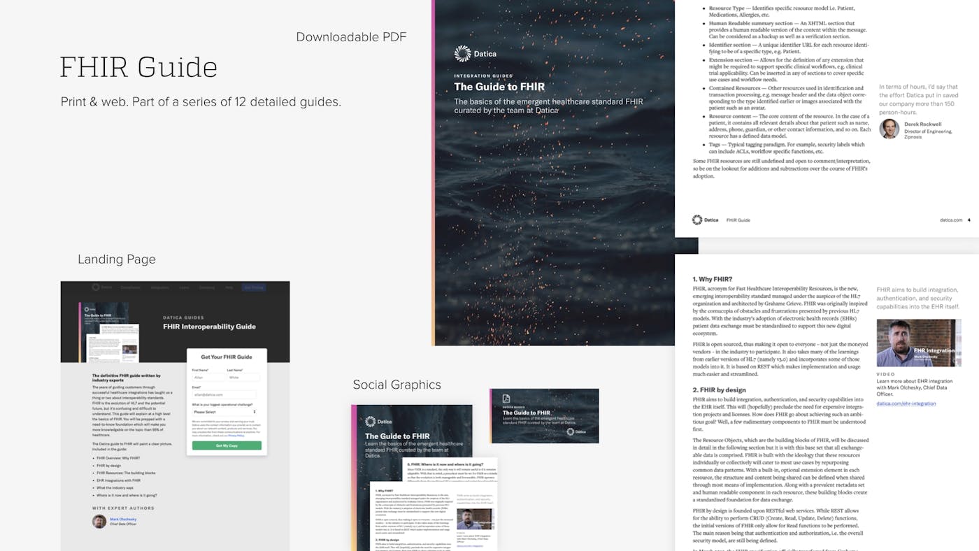
Downloadable guides, white papers, case studies, and magazine-style reports fuel Datica’s content strategy.
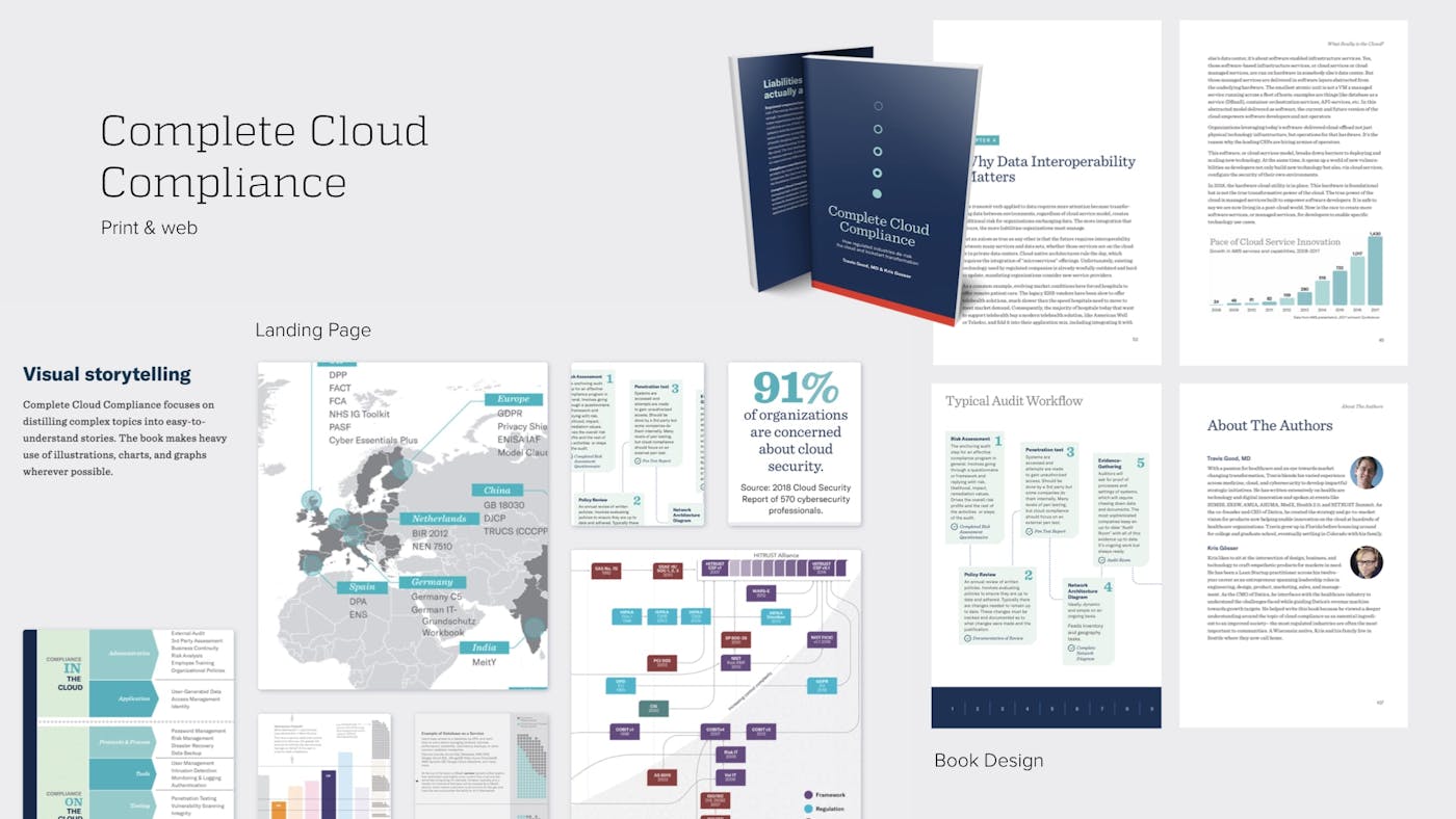
Print & Long-form: Tentpole Content
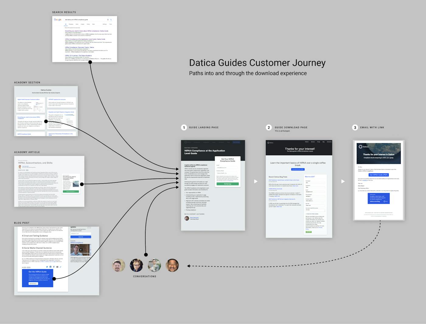
Print projects (though delivered as PDF) included magazine-style guides and reports, and doing the primary layout, typography, and site for the Complete Cloud Compliance book. These were key components of the content marketing strategy; they drove traffic from Google, live events, and email campaigns through our Hubspot sales automation system.
