Digital Health Success Framework
A multidimensional long-form timeline experience for healthcare startups
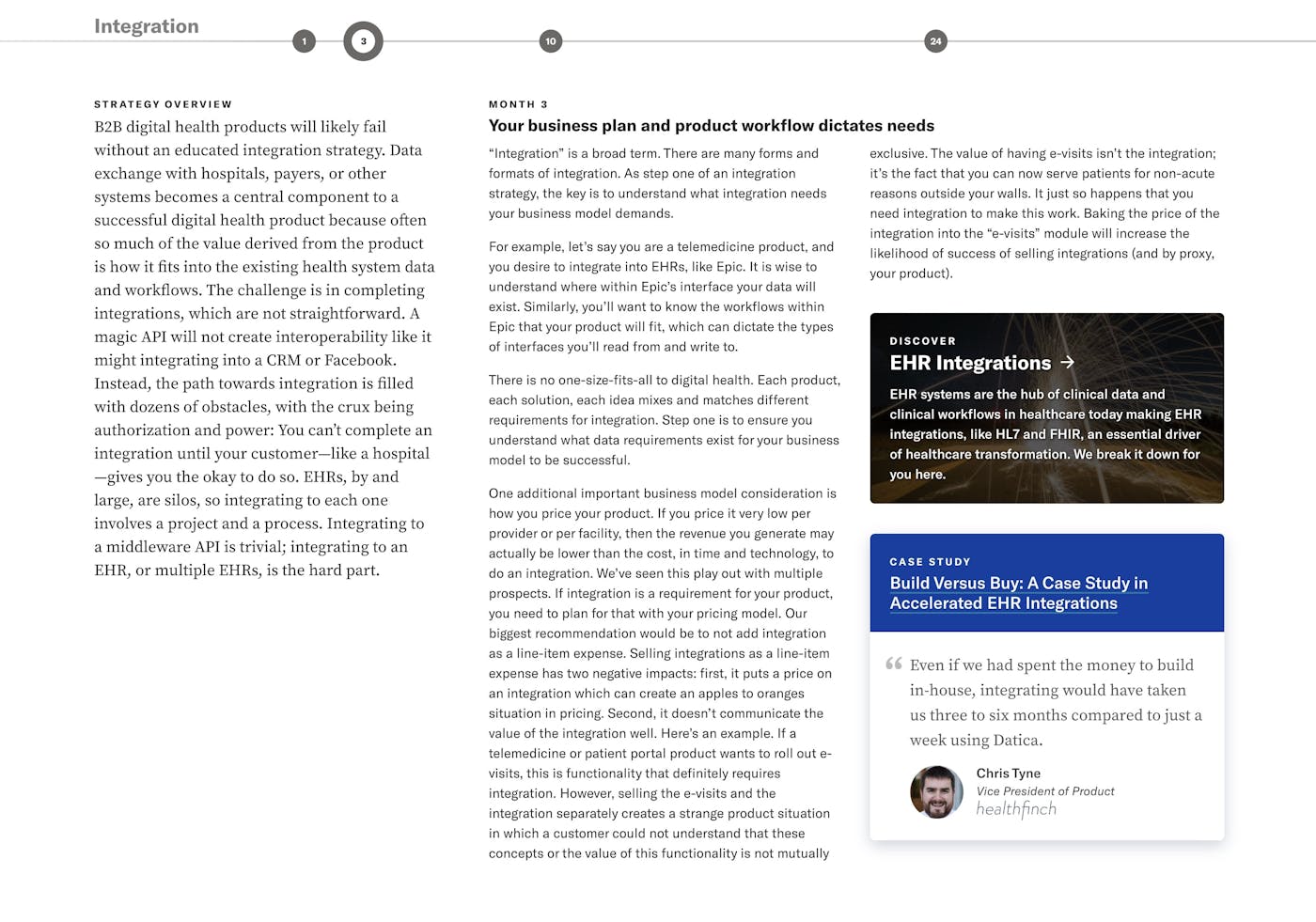
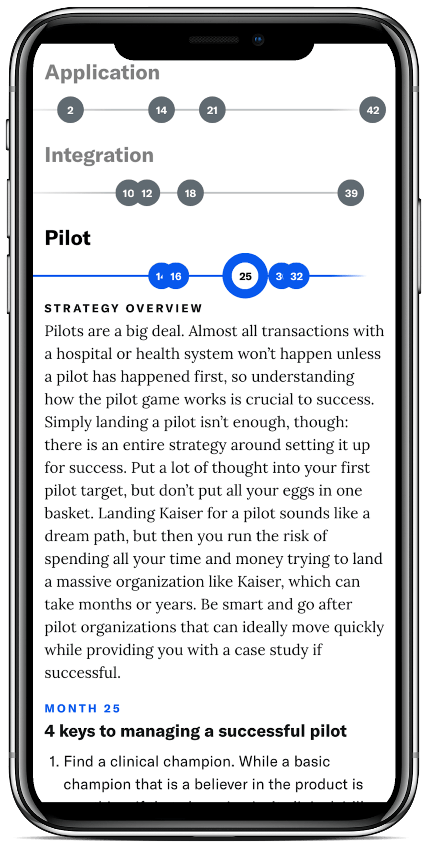
The Digital Health Success Framework (DHSF) is an interactive collection of articles and resources to help early-stage healthcare startups and enterprise innovation teams navigate the requirements and demands of healthcare apps and services.
I created the design, online experience, did the data modeling, video and motion graphics, as well as created eBook and presentation versions.
I wrote about some of the data-modeling challenges for Contentful’s blog.
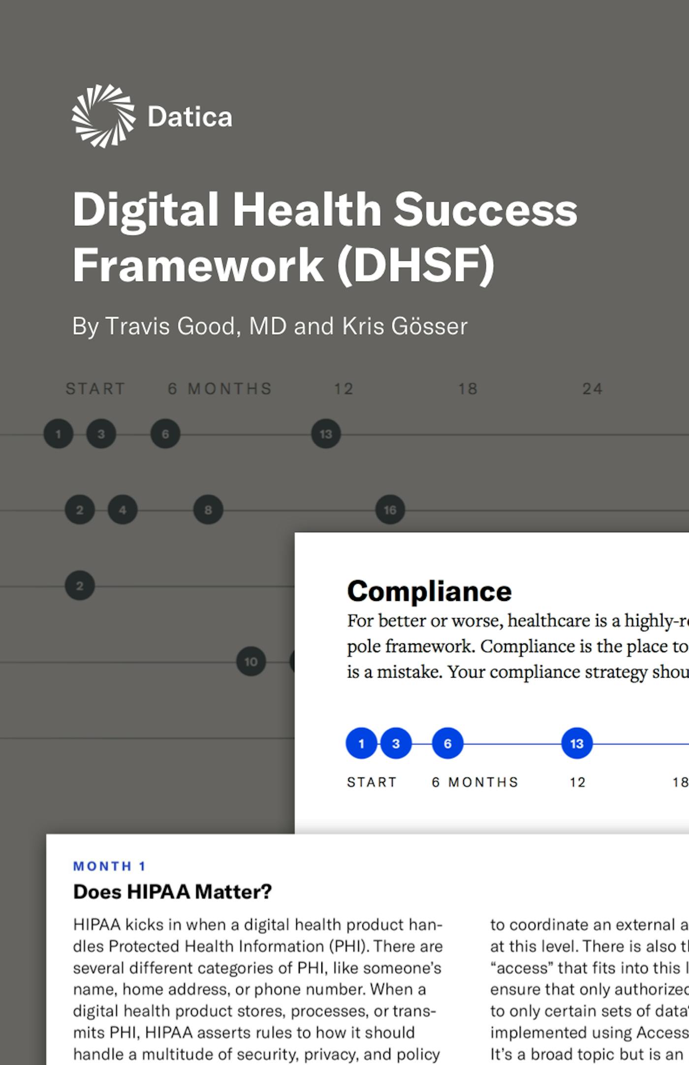
Digital Health Success Framework
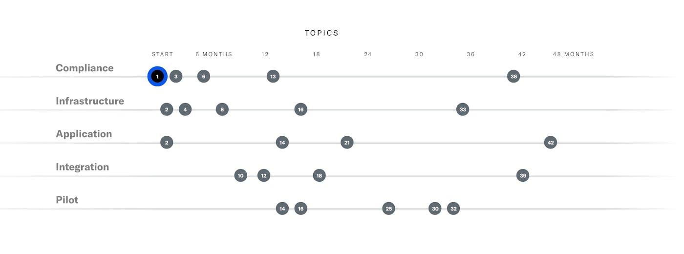
Exploring content across categories and time
Datica’s compliance and integration services are highly complex, with very long sales cycles for larger organizations. We found that developers and IT organizations needed help understanding the the regulatory environment of healthcare data.
The DHSF was conceived by Datica’s VP of Marketing, Kris Gösser, to help early-stage (0-2 years) healthcare startups understand what areas they needed to improve on. It served as top-of-funnel mechanism to not only help developer, advisor, and buyer personas know where they stood, but also what educational content they’d need next.
Introductory Video
I produced this video of Datica’s founder and CEO, Dr. Travis Good. I did the editing, sound, and motion graphics. Cinematography: Tyson Rowley
Process & Early Concepts
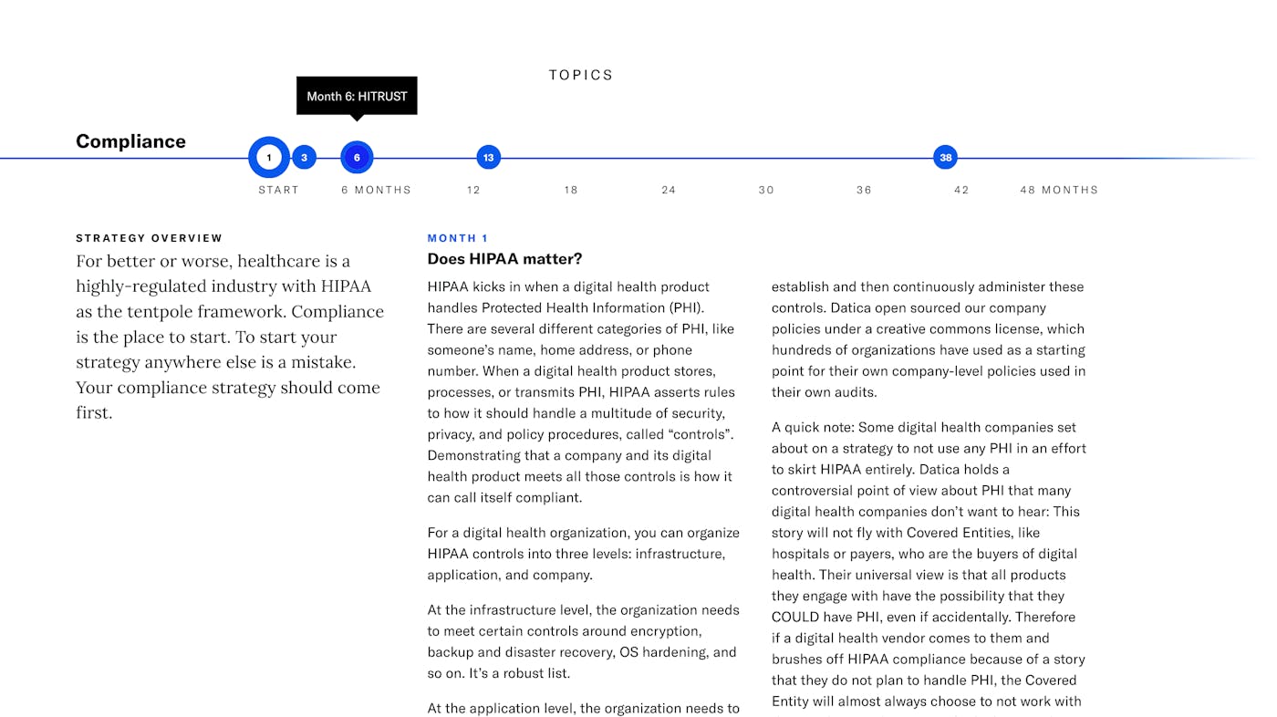
The content of the DHSF would span both time, category dimensions, and space. This could confuse users or allow them to lose their “situational awareness” of where they were. One way to maintain the users sense of place is to use intelligent animations and transitions.
Before committing these interaction concepts to code, I used Keynote prototype some of the transitions.
Accessible navigation & smart multi-columns
The entire system can be navigated with tab keys and arrow keys with some accessible hints added.
When the amount of copy exceeds a certain threshold, a multi-column CSS is injected in the markup for smarter copyfitting.
Unique construction & data modelling challenges
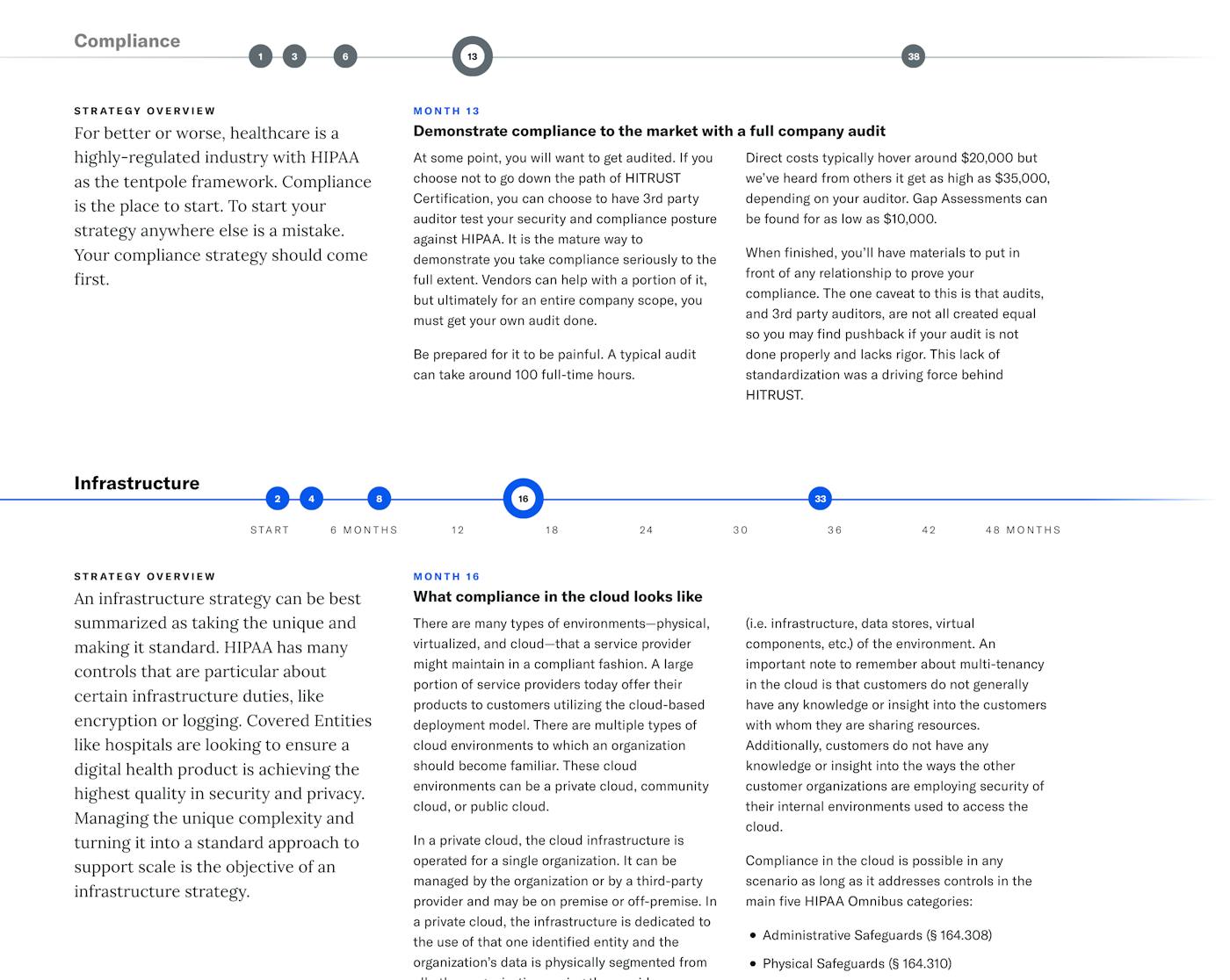
The interactive matrix allowed us to attach articles, crosslinks, and other online initiatives to give readers a sense of time and scale in their journey — and tailored calls-to-action to move forward into the sales funnel.
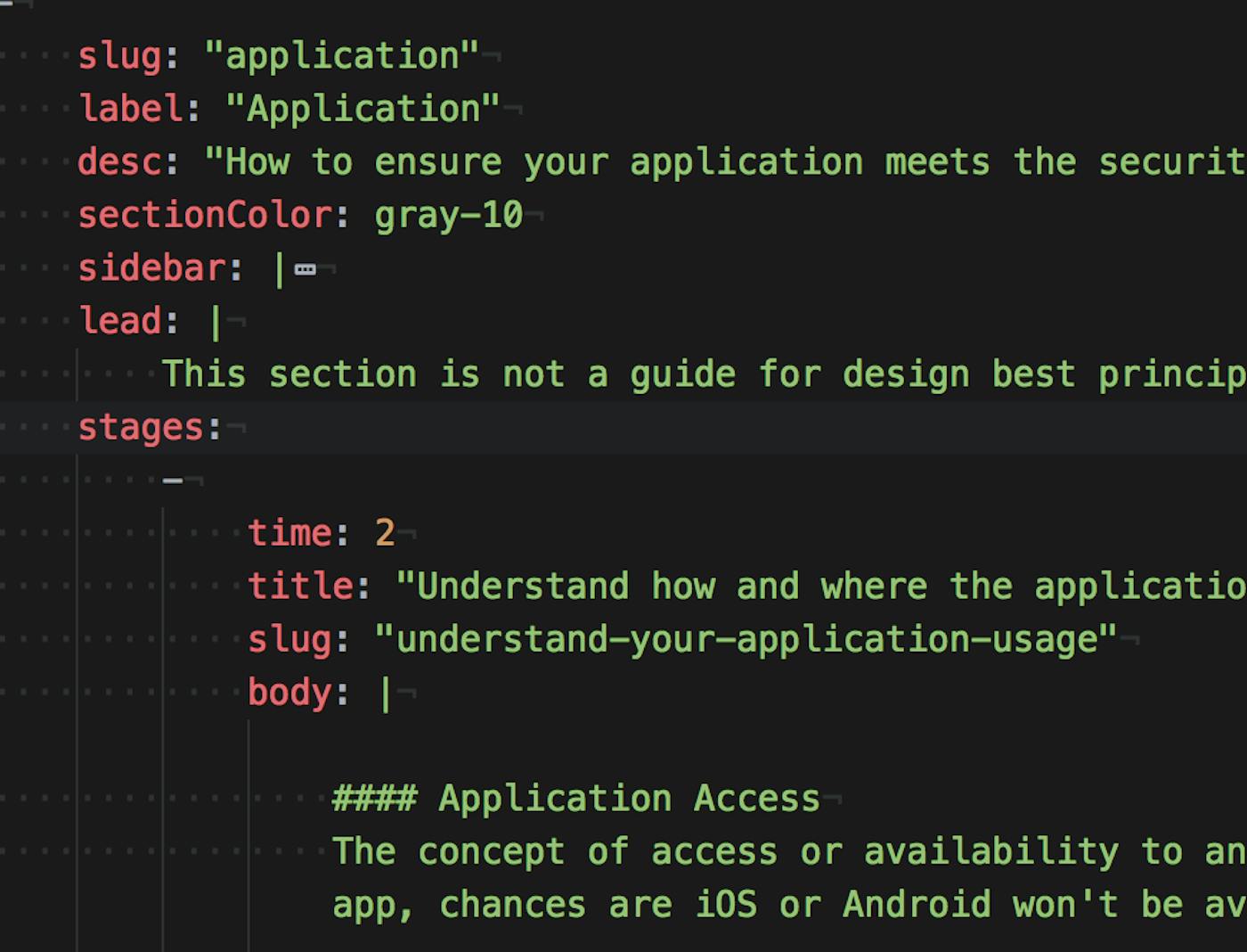
The data model presented some unique challenges. For maximum flexibility, all content is managed with custom YAML files. The months are converted to relative positions and styles injected into the markup. For the front-end stack, we used Zurb Foundation as the basis for datica.com and I heavily modified the tab component. This let us focus on design without sacrificing accessibility and things like keyboard navigation. Additional Javascript events orchestrate actions like the CSS animation classes that guide the viewer’s eye at the start.
