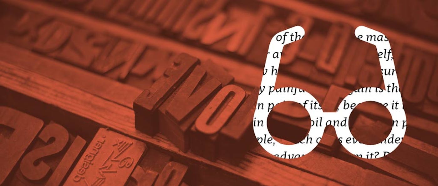
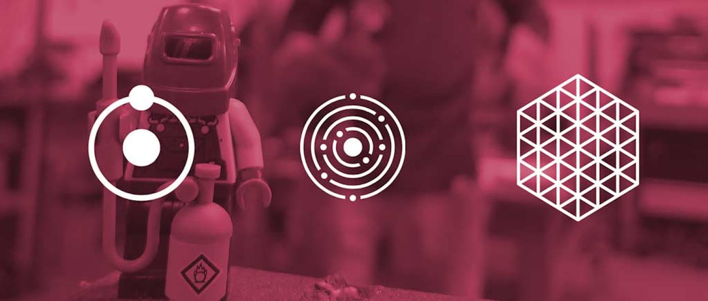
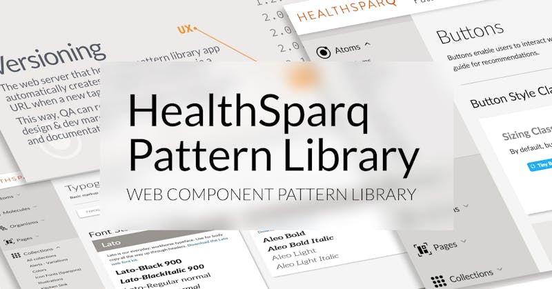
Illustrations
Custom blog artworks and illustrations for editorial work
For web editorial projects, I like to impose challenging, arbitrary creative constraints on myself, which has a twofold benefit: it gets done fast, and often creates better results from the artificial creative pressure.
Illustrations
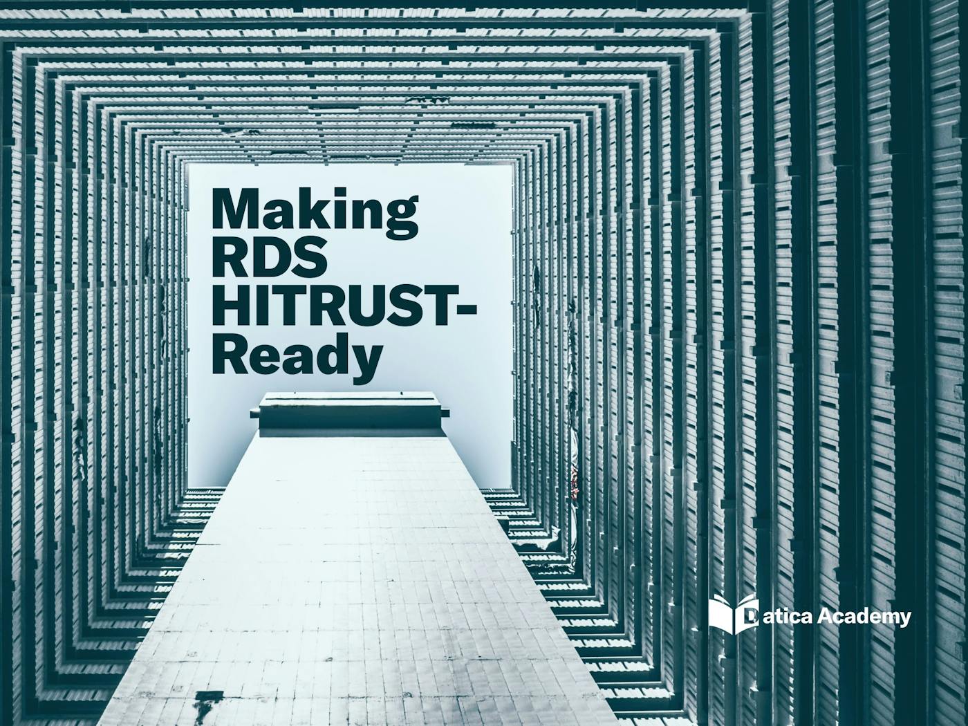
Datica Academy Series
The Datica Academy is the content channel for technical and training content. It helps pre-sales customers and developers learn more about complex healthcare topics like HIPAA, HITRUST, HL7, and more.
I created these “Series” illustrations for a planned collection of Academy articles around a given topic. I added other typefaces and chose to push outside the Datica brand a bit here to make them stand out among other content.


Datica + Kubernetes T-Shirts
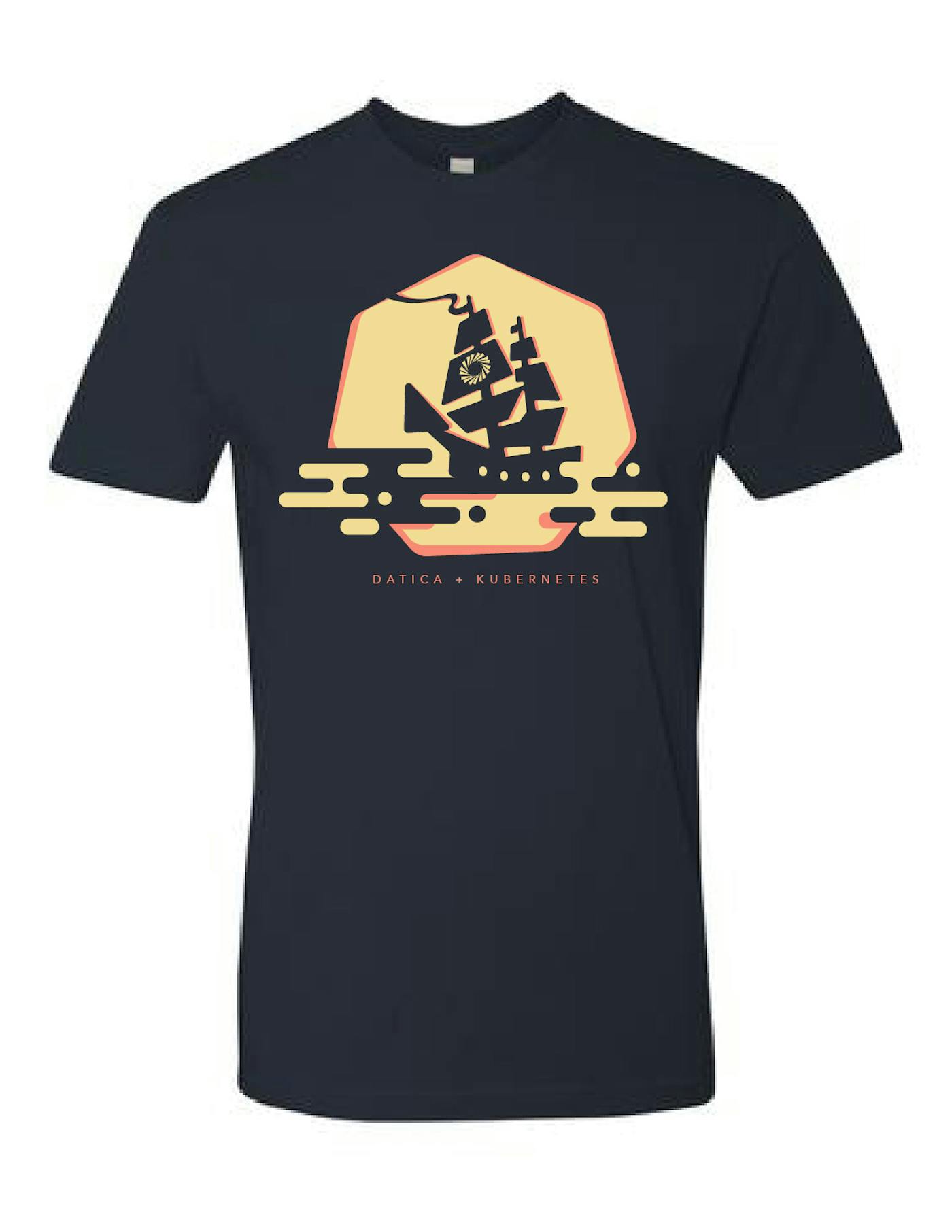
For the launch of a new product that leveraged Kubernetes (a container orchestration platform), I was asked to create some T-shirts for the engineering team and as a giveaway at events.
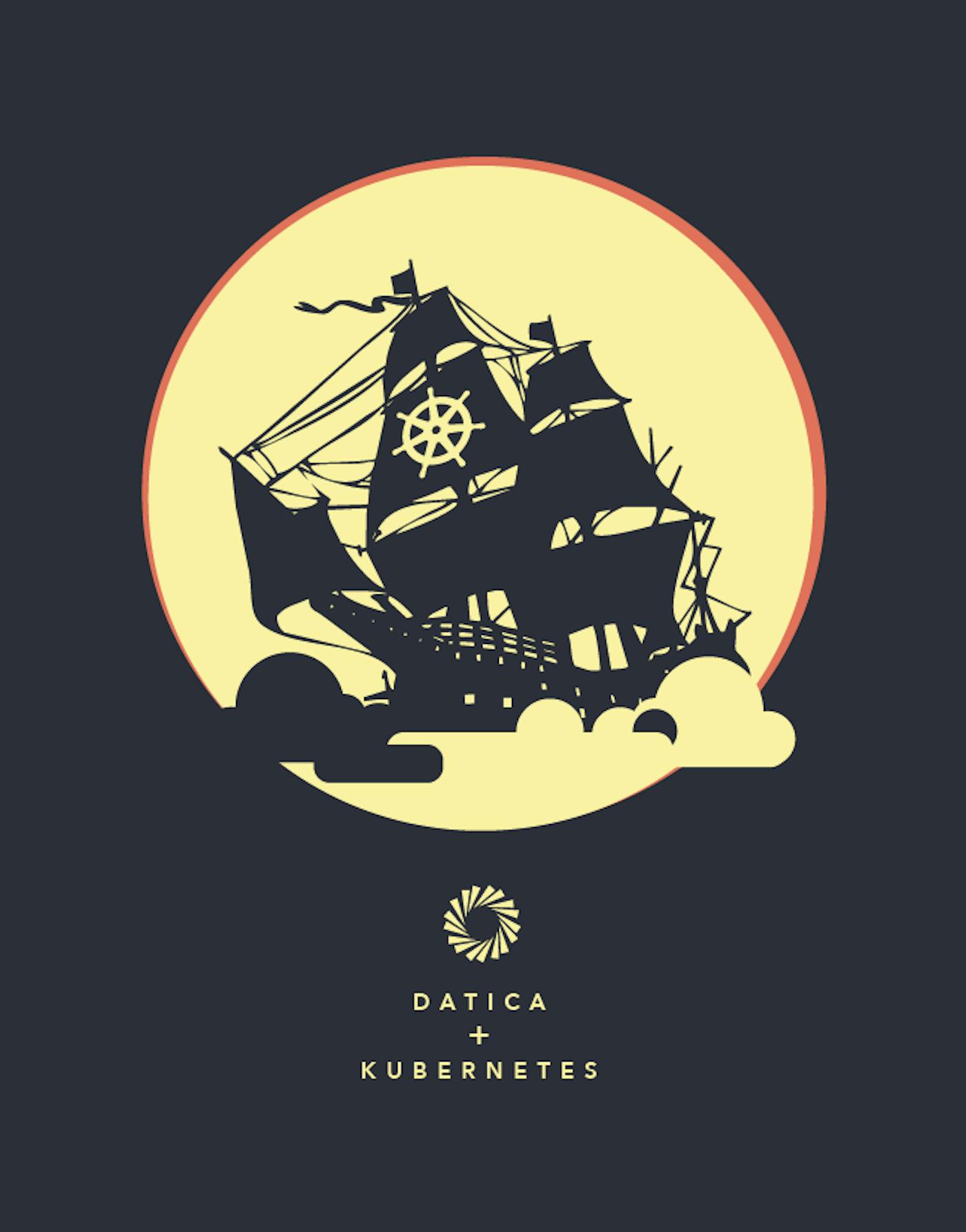
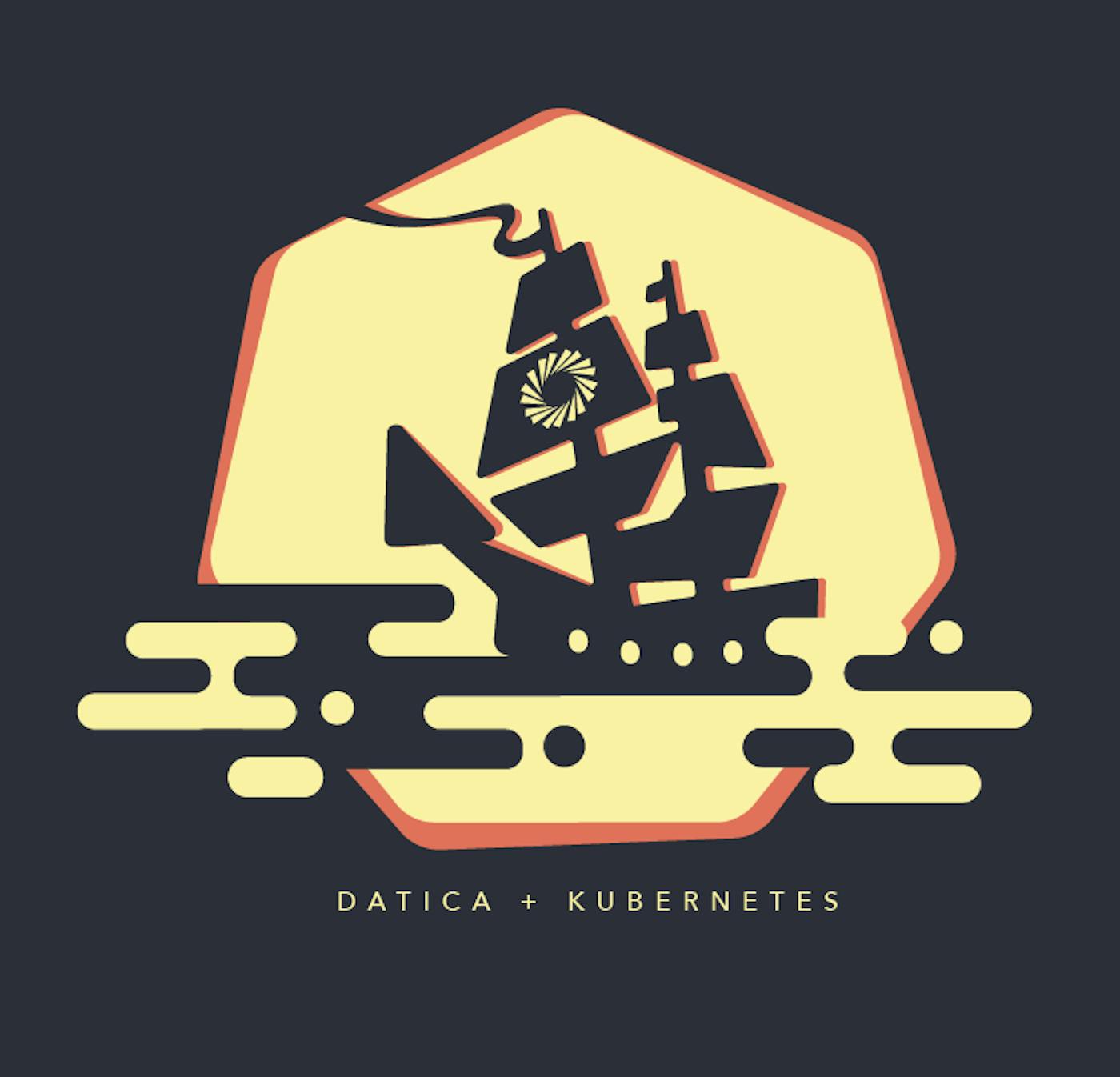
I started with the 7-sided Kubernetes logo with the ship’s wheel. This led me to some nautical themes, and I found this cool old “Old Spice” ship (or was it The Pirate Bay? You decide!). I liked the idea of a a ship floating in on the clouds with the moon behind it.
I tried several variations and chose to make it a bit more modern and “blobby”. Inspired by the visual style of the “Kurzgesagt” web series, I arrived at this jaunty ship, floating on clouds. Here to orchestrate all your things!
The team loved the shirts, they vanished immediately. Like… a ship on the mists.

Various illustrations
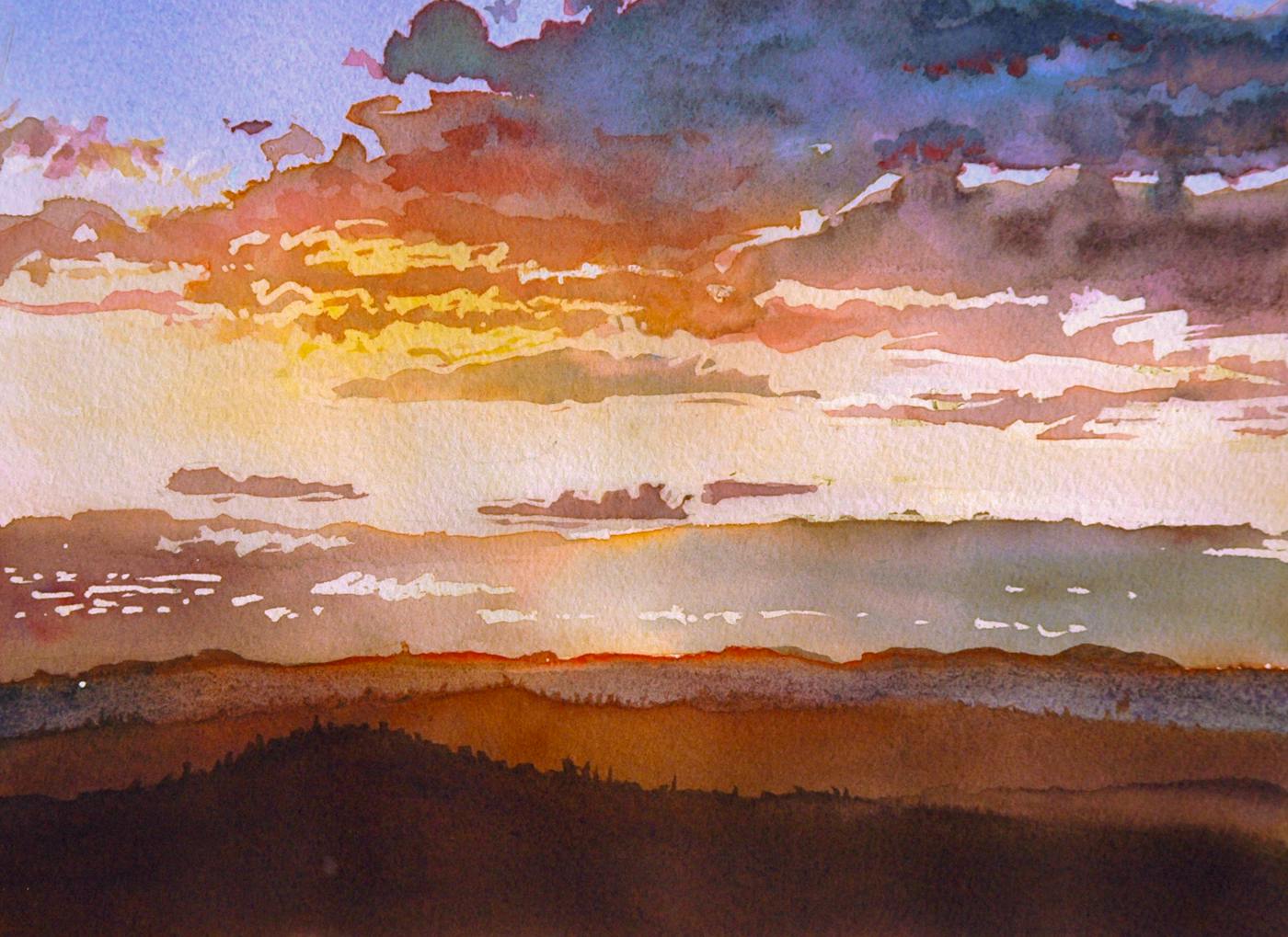
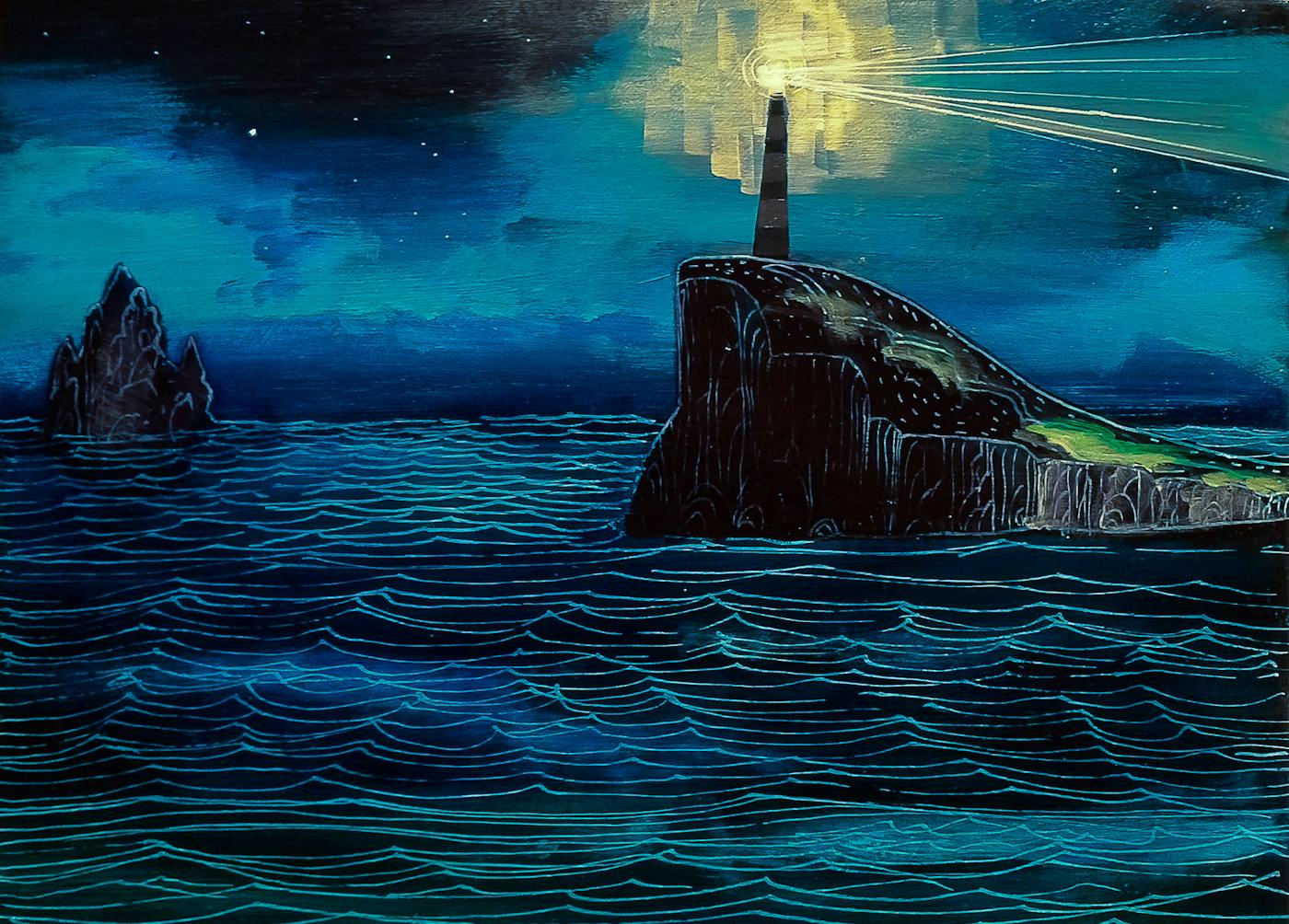
A few other personal projects. Painting is dear to my heart and I miss it.

Palau Blog Illustrations
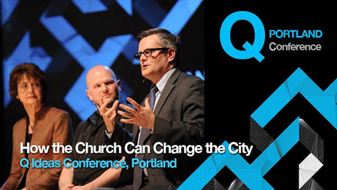
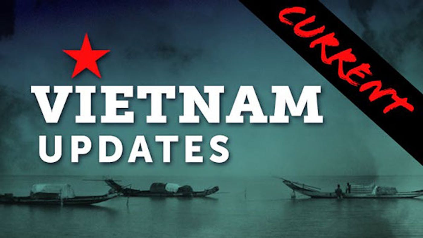
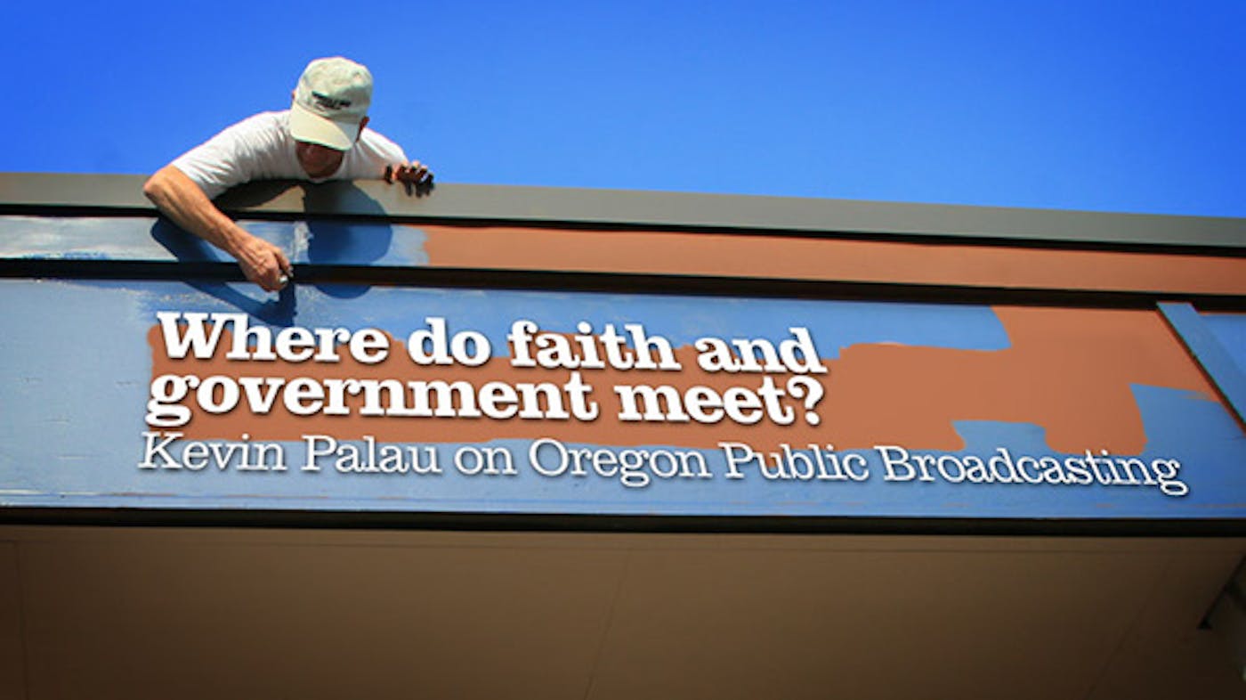
For a new blog we were launching at Palau.org, I made sure there was space in the editorial calendar and the publishing platform (Wordpress) for custom illustrations. Each piece was “timeboxed” to 20 minutes each, using creative commons-licensed images from Flickr or other sources, and had to support the editorial theme. These were always fun to crank out.



Healthsparq UX Blog
I started a Tumblr for the UX team at Healthsparq to create a venue for us to write as a group. Following a similar pattern of creative constraints, I created these quickly, combining strict rules about color, a background image, and icon or white artwork.
